Tiffany Lim

Work

About

Contact

Swagbucks Live Daily Trivia

Launched Swagbucks Live Daily Trivia, an automated anytime trivia experience that led to a 30% increase in user engagement and acquisition.

Role

Product Designer

Timeline

1 Month

Impact at a glance

+30% user engagement and acquisition

Resposnsibilities

Product StrategyUX Design

Visual Design

Swagbucks is a popular rewards platform where users earn points (SB) by completing everyday tasks like shopping online, answering surveys, watching videos, or playing games. Points can be redeemed for gift cards or cash, making it a go-to platform for millions of value-driven users.


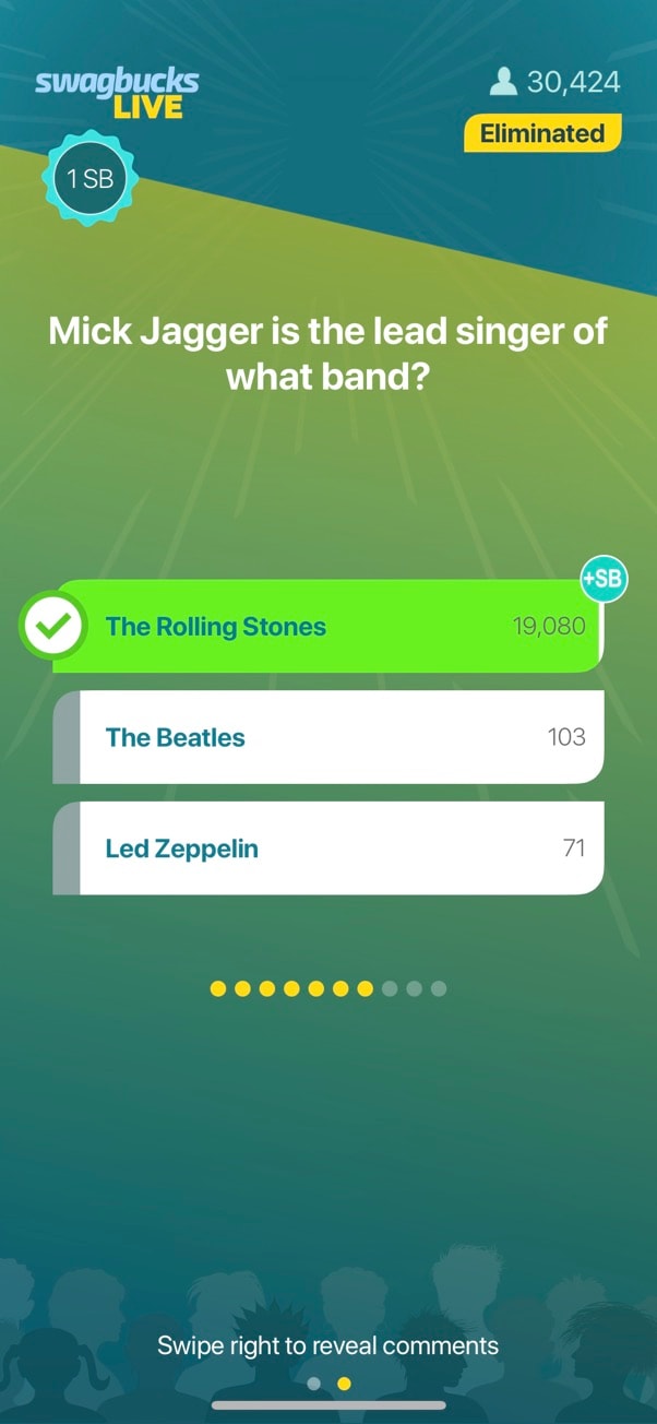
One way for users to earn daily was by downloading and playing Swagbucks Live. The app offered a daily live trivia game at 5PM PST, where around 30,000 players competed in real time for bonus SB. With a live host, real-time questions, and a community-driven format, the game felt like a mini game show on your phone.


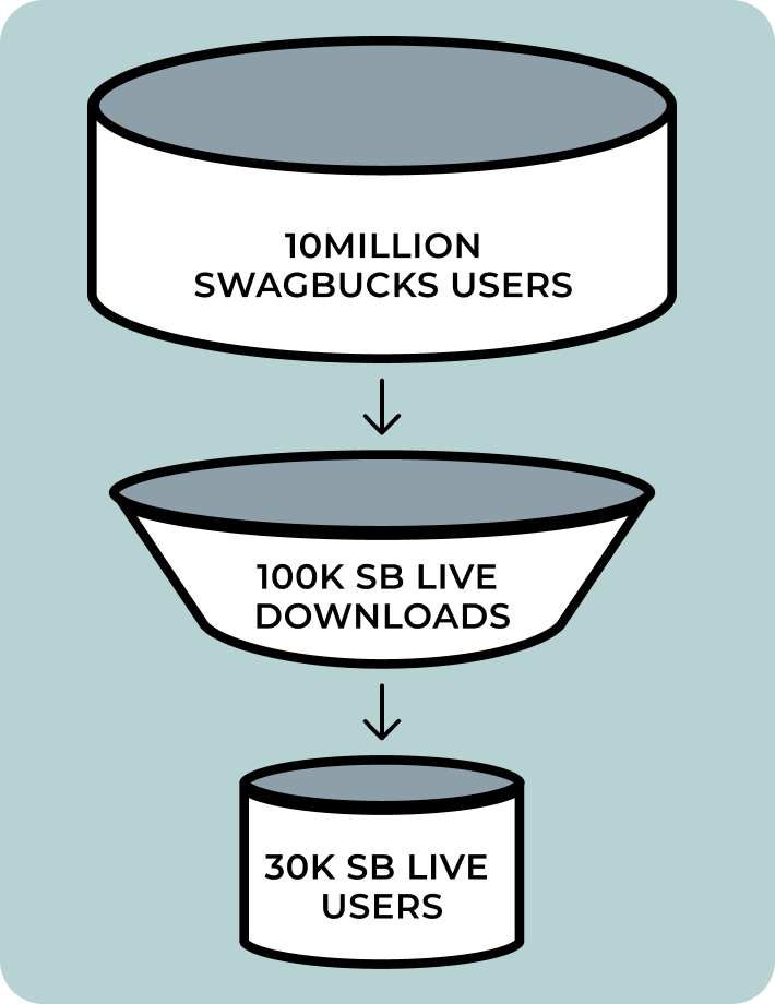
Despite its strong retention, fewer than 1% of Swagbucks users participated. The fixed daily timeslot made the game inaccessible for most users.


To make gameplay more flexible and expand reach, we set out to redesign the app and introduce a hostless, on-demand trivia mode, an experience users could access anytime, without losing the excitement of live play.

The Problem

Strong Retention, Limited Reach

Swagbucks Live had high return rates, but low reach. Despite having over 10 million users, the game only reached 30,000 users daily due to only offering one fixed daily game. This excluded users in different time zones or with conflicting schedules.


How might we make the game more accessible, more interactive, and more rewarding so more users can join in on the fun?
Goals

Aligning user needs with business growth
User Goal

Provide users an opportunity to play Swagbucks Live at their convenience to earn more points.

Business Goal

Increase user engagement on the Swagbucks Live app by reaching users who are typically unavailable for the live hosted trivia game.

Discovery

Uncovering key insights with limited resources

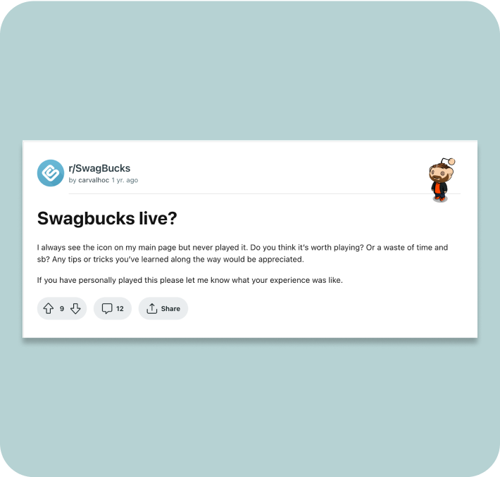
With no budget for interviews or surveys, I turned to what was available, reviews and community posts across the iOS App Store, Google Play, Reddit, and Facebook. Overall, users loved the game for its simplicity and quick rewards. The message board before each game gave players a rare opportunity to connect with others, which stood out in an otherwise solo experience.


But there were clear pain points. Many users couldn’t make the 5PM game, and those who did often found the host irritating. Some just wanted to play quietly at their own pace.

Digging into the analytics, we found:

  • Users engaged with the app for a max of 30 minutes per day
  • Activity spiked during the 10-minute live game and the pre-game chat window
  • First-time users who downloaded the app outside of the game window were unlikely to return
  • The app’s ad wall offered better deals than the website, but was rarely accessed

All signs pointed to a need for a more flexible, all-day experience with improved discovery and usability.

Design Audit

Identifying friction points and structural gaps

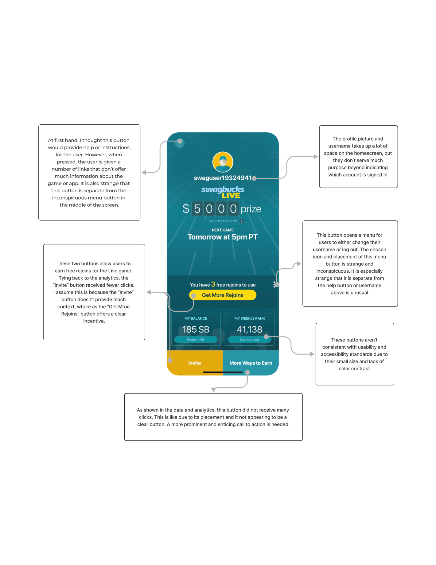
Before jumping into solutions, I conducted a design audit of the existing Swagbucks Live app. While the app functioned well for the live trivia game, it wasn’t built to support multiple experiences or onboard new users effectively.


Key findings included:

  • Redundant navigation and unclear CTAs that confused user flow
  • Scattered information architecture, making it hard to surface value features like the ad wall or “More Ways to Earn”
  • Visual inconsistencies in typography, spacing, and buttons
  • No support for first-time users, despite needing guidance for live play mechanics and rejoin collection

The audit helped shape my priorities going forward: clean up the structure, improve scannability, and create space for a new trivia experience without overwhelming users.

Process

Designing the foundation for a new way to play

Once the opportunity was clear, I reimagined the structure of the app to support both live and on-demand trivia without overwhelming users.

Information Architecture

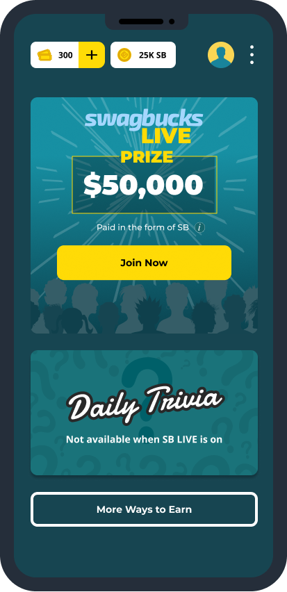
Restructured the app to prioritize gameplay, reduce clutter, and surface value features like “More Ways to Earn” ad wall.

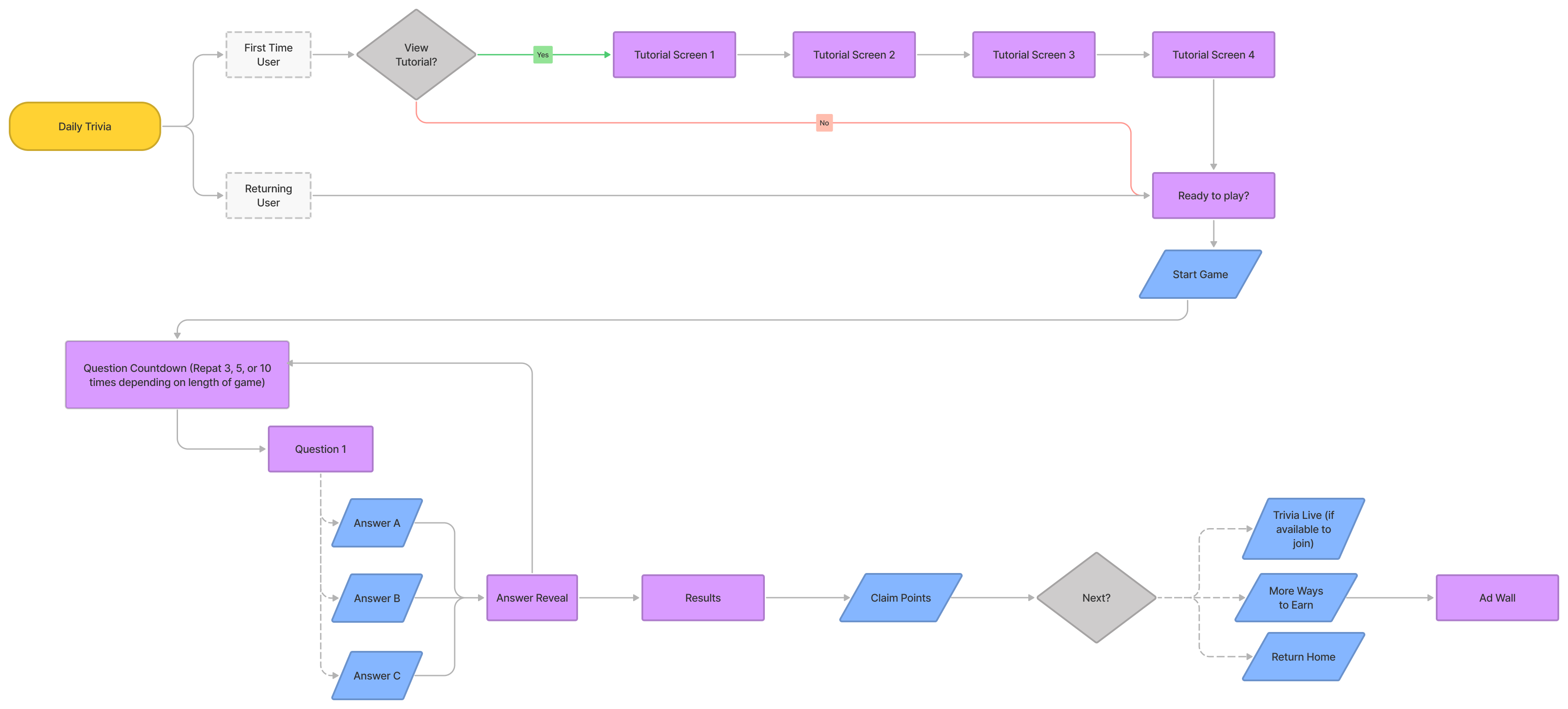
User Flows

Mapped flows for both new and returning users across Daily Trivia Challenge and live game modes.

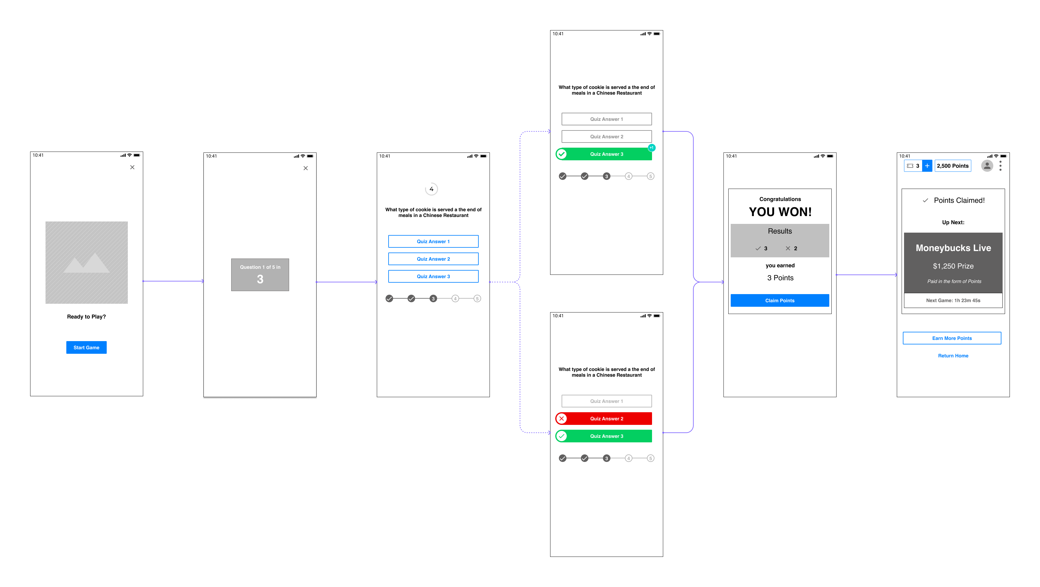
Wireframes

Sketched key screens to define layout and hierarchy early. These included homepage, game screens, and result states.

Gameplay Mechanics

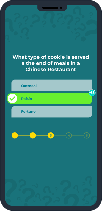
I designed the core loop for the new trivia experience, including onboarding, transitions, and timing. Through internal testing, we landed on 10 seconds per question with a 3-second countdown, fast enough to keep momentum, but still readable. The result was a quick, self-guided game that stayed true to the energy of the live version.

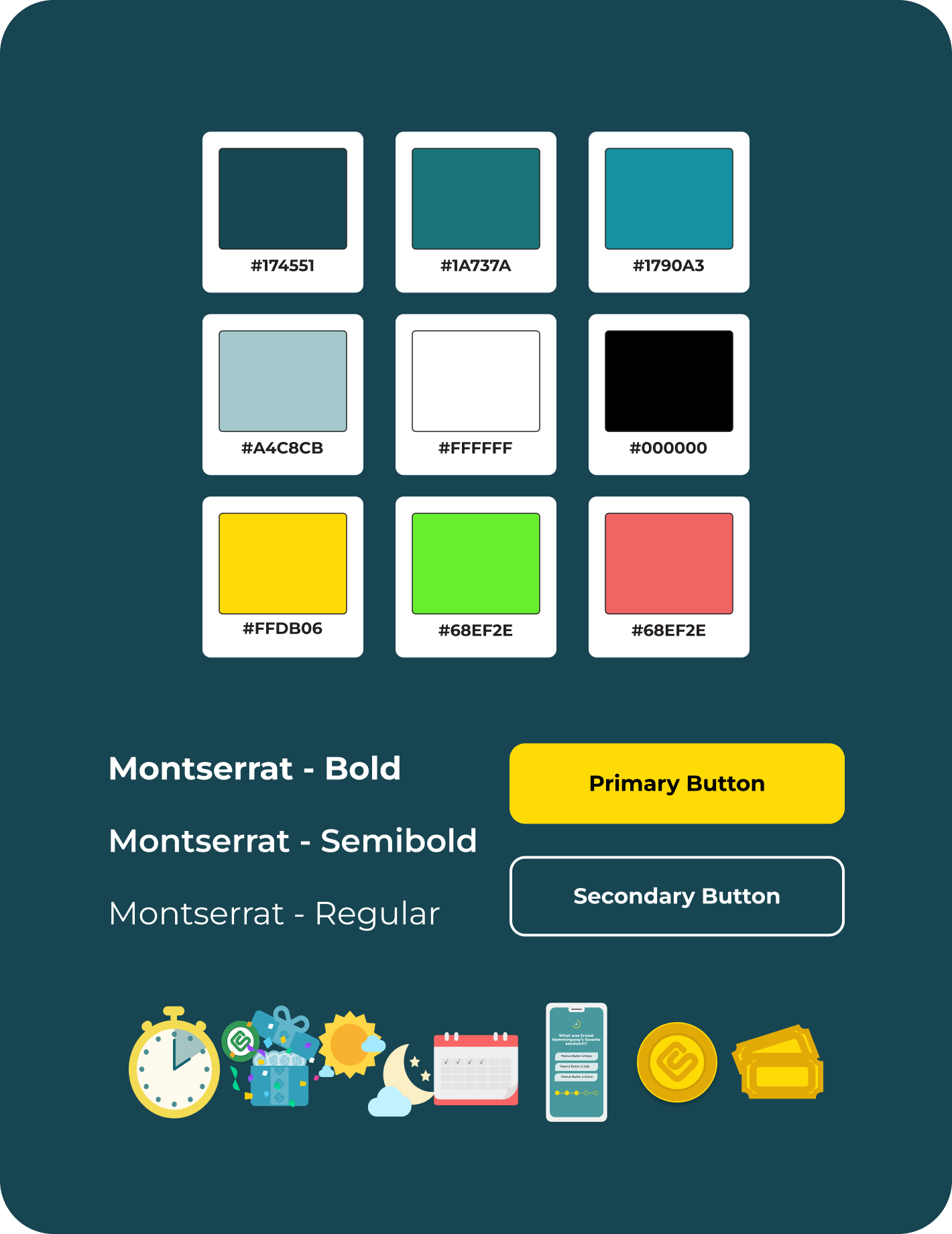
Visual Redesign

I led a full visual refresh of the app, updating typography, color, and layout for better clarity and consistency. I also created custom illustrations for onboarding, empty states, and results screens to bring warmth and guide users through the experience.

Delivery

Play anywhere, anytime

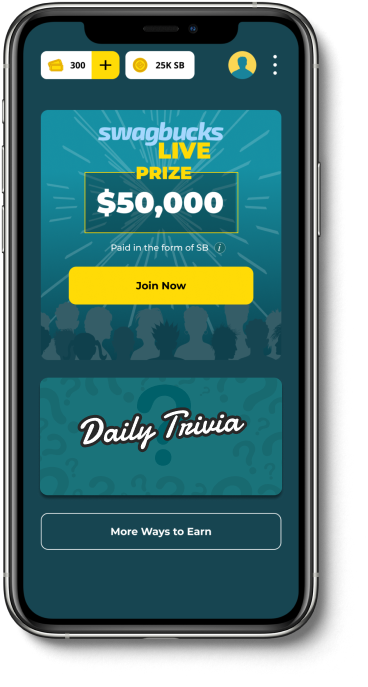
Homepage Redesign

Simplified layout and entry points for both trivia modes with clearer CTAs.

First Time User Experience

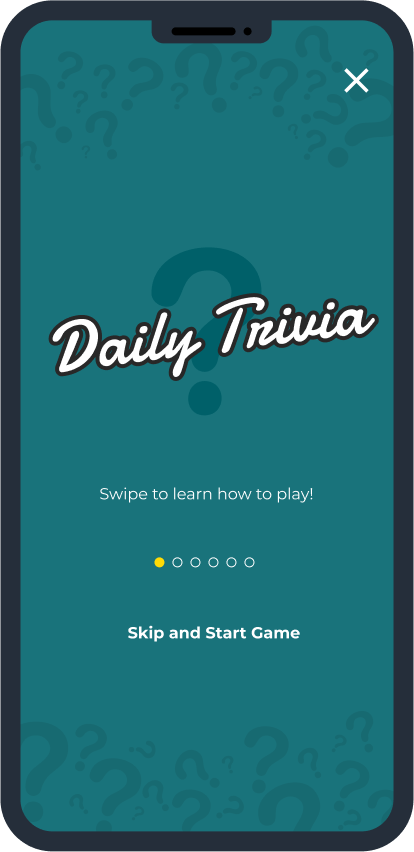
To help onboard users playing the Daily Trivia Challenge for the first time, I designed self-guided onboarding screens explaining the rules of the game for the user.

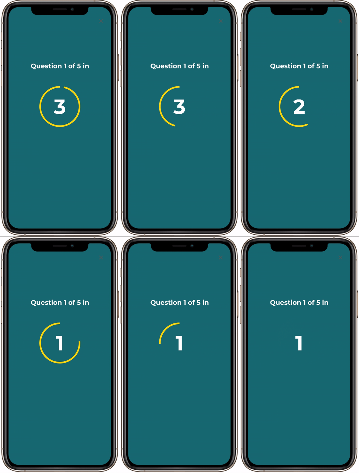
Transitions

To transition users into the game and in between questions, users are given a 3-second countdown to prepare.

Timing

To create a sense of urgency while still giving users enough time to respond, each question was timed at 10 seconds.

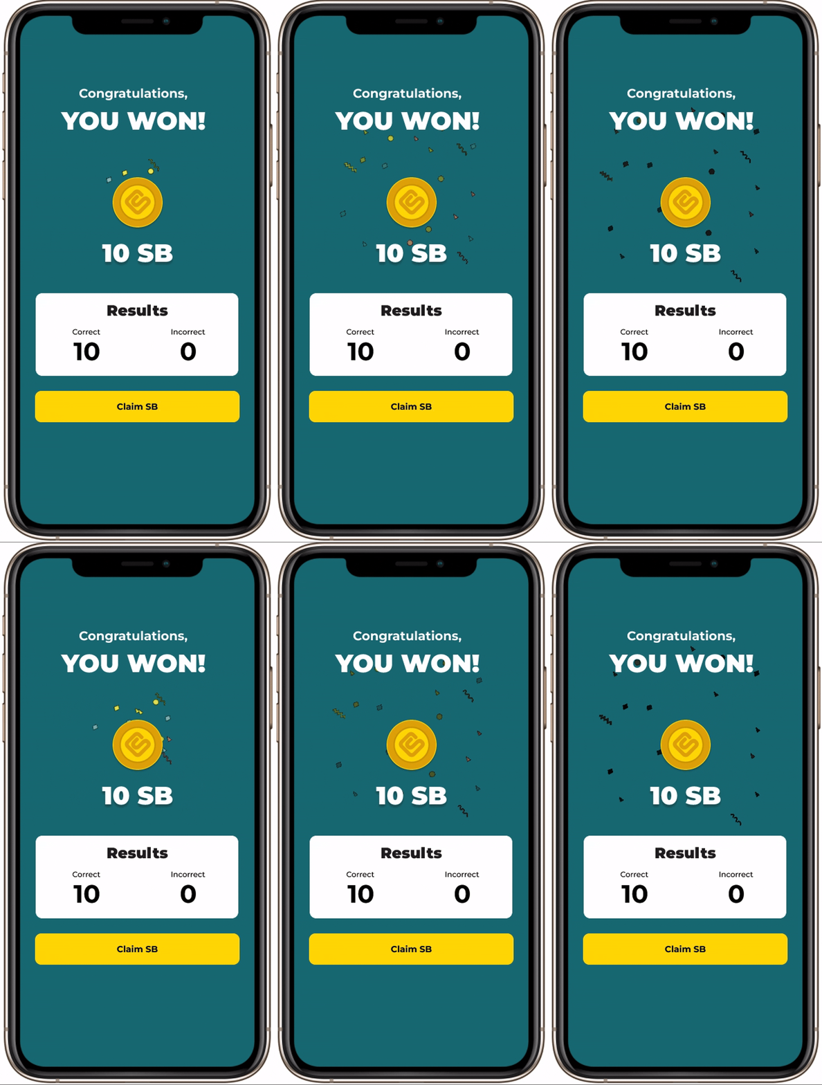
Finishing the Game

Users typically judge an experience based on how they feel at its peak and its end (Peak-end rule) so I wanted to end the game on a high note. Whether a user wins it all, some, or none, they're celebrated at the end of each game.

Reflection

Measurable success after launch

This project reminded me that great design often means making smart tradeoffs in imperfect conditions. We saw a clear boost in engagement, but post-launch feedback showed that some users felt rushed during gameplay. I had tested timing internally with Prodege employees, who had stronger literacy and context than our broader user base. Without a budget or timeline for formal usability testing, this was the most scrappy yet available option.


In hindsight, I would push for broader testing or design for a slightly wider range of reading speeds. It was a valuable reminder that even fast-paced products benefit from inclusive defaults—and that internal testing can miss the nuances of real-world users.

Up Next

Thanks For Reading

Thanks for taking the time to read this case study, I hope it gave you a glimpse into how I approach product design when working within constraints, balancing scrappy research, visual clarity, and gameplay design to create a more accessible experience.


If you're curious to see more, feel free to check out my other case studies:

Slickdeals Search Redesign

Community Growth Experiments

AI Comment Summary

Notifications System

Let’s Connect.

linkedin

hello@tiffanylim.design

© Tiffany Lim, 2025. Made with love, Figma, and coffee.

Work

Play

About

Resume

Swagbucks Live Daily Trivia

Launched Swagbucks Live Daily Trivia, an automated anytime trivia experience that led to a 30% increase in user engagement and acquisition.

Role

Product Designer

Resposnsibilities

Product StrategyUX Design

Visual Design

Timeline

1 Month

Impact at a glance

+30% user engagement and acquisition

Swagbucks is a popular rewards platform where users earn points (SB) by completing everyday tasks like shopping online, answering surveys, watching videos, or playing games. Points can be redeemed for gift cards or cash, making it a go-to platform for millions of value-driven users.


One way for users to earn daily was by downloading and playing Swagbucks Live. The app offered a daily live trivia game at 5PM PST, where around 30,000 players competed in real time for bonus SB. With a live host, real-time questions, and a community-driven format, the game felt like a mini game show on your phone.


Despite its strong retention, fewer than 1% of Swagbucks users participated. The fixed daily timeslot made the game inaccessible for most users.


To make gameplay more flexible and expand reach, we set out to redesign the app and introduce a hostless, on-demand trivia mode, an experience users could access anytime, without losing the excitement of live play.

The Problem

Strong Retention, Limited Reach

Swagbucks Live had high return rates, but low reach. Despite having over 10 million users, the game only reached 30,000 users daily due to only offering one fixed daily game. This excluded users in different time zones or with conflicting schedules.


How might we make the game more accessible, more interactive, and more rewarding so more users can join in on the fun?

Goals

Aligning user needs with business growth

User Goal

Provide users an opportunity to play Swagbucks Live at their convenience to earn more points.

Business Goal

Increase user engagement on the Swagbucks Live app by reaching users who are typically unavailable for the live hosted trivia game.

Discovery

Uncovering key insights with limited resources

With no budget for interviews or surveys, I turned to what was available, reviews and community posts across the iOS App Store, Google Play, Reddit, and Facebook. Overall, users loved the game for its simplicity and quick rewards. The message board before each game gave players a rare opportunity to connect with others, which stood out in an otherwise solo experience.


But there were clear pain points. Many users couldn’t make the 5PM game, and those who did often found the host irritating. Some just wanted to play quietly at their own pace.

Digging into the analytics, we found:

  • Users engaged with the app for a max of 30 minutes per day
  • Activity spiked during the 10-minute live game and the pre-game chat window
  • First-time users who downloaded the app outside of the game window were unlikely to return
  • The app’s ad wall offered better deals than the website, but was rarely accessed

All signs pointed to a need for a more flexible, all-day experience with improved discovery and usability.

Design Audit

Identifying friction points and structural gaps

Before jumping into solutions, I conducted a design audit of the existing Swagbucks Live app. While the app functioned well for the live trivia game, it wasn’t built to support multiple experiences or onboard new users effectively.


Key findings included:

  • Redundant navigation and unclear CTAs that confused user flow
  • Scattered information architecture, making it hard to surface value features like the ad wall or “More Ways to Earn”
  • Visual inconsistencies in typography, spacing, and buttons
  • No support for first-time users, despite needing guidance for live play mechanics and rejoin collection

The audit helped shape my priorities going forward: clean up the structure, improve scannability, and create space for a new trivia experience without overwhelming users.

Process

Designing the foundation for a new way to play

Once the opportunity was clear, I reimagined the structure of the app to support both live and on-demand trivia without overwhelming users.

Information Architecture

Restructured the app to prioritize gameplay, reduce clutter, and surface value features like “More Ways to Earn” ad wall.

User Flows

Mapped flows for both new and returning users across Daily Trivia Challenge and live game modes.

Wireframes

Sketched key screens to define layout and hierarchy early. These included homepage, game screens, and result states.

Gameplay Mechanics

I designed the core loop for the new trivia experience, including onboarding, transitions, and timing. Through internal testing, we landed on 10 seconds per question with a 3-second countdown, fast enough to keep momentum, but still readable. The result was a quick, self-guided game that stayed true to the energy of the live version.

Visual Redesign

I led a full visual refresh of the app, updating typography, color, and layout for better clarity and consistency. I also created custom illustrations for onboarding, empty states, and results screens to bring warmth and guide users through the experience.

Delivery

Play anywhere, anytime

Homepage Redesign

Simplified layout and entry points for both trivia modes with clearer CTAs.

First Time User Experience

To help onboard users playing the Daily Trivia Challenge for the first time, I designed self-guided onboarding screens explaining the rules of the game for the user.

Transitions

To transition users into the game and in between questions, users are given a 3-second countdown to prepare.

Timing

To create a sense of urgency while still giving users enough time to respond, each question was timed at 10 seconds.

Finishing the Game

Users typically judge an experience based on how they feel at its peak and its end (Peak-end rule) so I wanted to end the game on a high note. Whether a user wins it all, some, or none, they're celebrated at the end of each game.

Reflection

Measurable success after launch

This project reminded me that great design often means making smart tradeoffs in imperfect conditions. We saw a clear boost in engagement, but post-launch feedback showed that some users felt rushed during gameplay. I had tested timing internally with Prodege employees, who had stronger literacy and context than our broader user base. Without a budget or timeline for formal usability testing, this was the most scrappy yet available option.


In hindsight, I would push for broader testing or design for a slightly wider range of reading speeds. It was a valuable reminder that even fast-paced products benefit from inclusive defaults—and that internal testing can miss the nuances of real-world users.

Up Next

Thanks For Reading

Thanks for taking the time to read this case study, I hope it gave you a glimpse into how I approach product design when working within constraints, balancing scrappy research, visual clarity, and gameplay design to create a more accessible experience.


If you're curious to see more, feel free to check out my other case studies:

Slickdeals Search Redesign

Community Growth Experiments

AI Comment Summary

Notifications System

Let’s Connect

linkedin

hello@tiffanylim.design

© Tiffany Lim, 2025. Made with love, Figma, and coffee.

Tiffany Lim

Work

Play

About

Resume

Swagbucks Live Daily Trivia

Launched Swagbucks Live Daily Trivia, an automated anytime trivia experience that led to a 30% increase in user engagement and acquisition.

Role

Product Designer

Responsibilities

Product StrategyUX Design

Visual Design

Timeline

1 Month

Impact at a glance

+30% user engagement and acquisition

Swagbucks is a popular rewards platform where users earn points (SB) by completing everyday tasks like shopping online, answering surveys, watching videos, or playing games. Points can be redeemed for gift cards or cash, making it a go-to platform for millions of value-driven users.


One way for users to earn daily was by downloading and playing Swagbucks Live. The app offered a daily live trivia game at 5PM PST, where around 30,000 players competed in real time for bonus SB. With a live host, real-time questions, and a community-driven format, the game felt like a mini game show on your phone.


Despite its strong retention, fewer than 1% of Swagbucks users participated. The fixed daily timeslot made the game inaccessible for most users.


To make gameplay more flexible and expand reach, we set out to redesign the app and introduce a hostless, on-demand trivia mode, an experience users could access anytime, without losing the excitement of live play.

The Problem

Strong Retention, Limited Reach

Swagbucks Live had high return rates, but low reach. Despite having over 10 million users, the game only reached 30,000 users daily due to only offering one fixed daily game. This excluded users in different time zones or with conflicting schedules.


How might we make the game more accessible, more interactive, and more rewarding so more users can join in on the fun?

Goals

Aligning user needs with business growth

User Goal

Provide users an opportunity to play Swagbucks Live at their convenience to earn more points.

Business Goal

Increase user engagement on the Swagbucks Live app by reaching users who are typically unavailable for the live hosted trivia game.

Discovery

Uncovering key insights with limited resources

With no budget for interviews or surveys, I turned to what was available, reviews and community posts across the iOS App Store, Google Play, Reddit, and Facebook. Overall, users loved the game for its simplicity and quick rewards. The message board before each game gave players a rare opportunity to connect with others, which stood out in an otherwise solo experience.


But there were clear pain points. Many users couldn’t make the 5PM game, and those who did often found the host irritating. Some just wanted to play quietly at their own pace.

Digging into the analytics, we found:

  • Users engaged with the app for a max of 30 minutes per day
  • Activity spiked during the 10-minute live game and the pre-game chat window
  • First-time users who downloaded the app outside of the game window were unlikely to return
  • The app’s ad wall offered better deals than the website, but was rarely accessed

All signs pointed to a need for a more flexible, all-day experience with improved discovery and usability.

Design Audit

Identifying friction points and structural gaps

Before jumping into solutions, I conducted a design audit of the existing Swagbucks Live app. While the app functioned well for the live trivia game, it wasn’t built to support multiple experiences or onboard new users effectively.


Key findings included:

  • Redundant navigation and unclear CTAs that confused user flow
  • Scattered information architecture, making it hard to surface value features like the ad wall or “More Ways to Earn”
  • Visual inconsistencies in typography, spacing, and buttons
  • No support for first-time users, despite needing guidance for live play mechanics and rejoin collection

The audit helped shape my priorities going forward: clean up the structure, improve scannability, and create space for a new trivia experience without overwhelming users.

Process

Designing the foundation for a new way to play

Once the opportunity was clear, I reimagined the structure of the app to support both live and on-demand trivia without overwhelming users.

Information Architecture

Restructured the app to prioritize gameplay, reduce clutter, and surface value features like “More Ways to Earn” ad wall.

User Flows

Mapped flows for both new and returning users across Daily Trivia Challenge and live game modes.

Wireframes

Sketched key screens to define layout and hierarchy early. These included homepage, game screens, and result states.

Gameplay Mechanics

I designed the core loop for the new trivia experience, including onboarding, transitions, and timing. Through internal testing, we landed on 10 seconds per question with a 3-second countdown, fast enough to keep momentum, but still readable. The result was a quick, self-guided game that stayed true to the energy of the live version.

Visual Redesign

I led a full visual refresh of the app, updating typography, color, and layout for better clarity and consistency. I also created custom illustrations for onboarding, empty states, and results screens to bring warmth and guide users through the experience.

Delivery

Play anywhere, anytime

Homepage Redesign

Simplified layout and entry points for both trivia modes with clearer CTAs.

First Time User Experience

To help onboard users playing the Daily Trivia Challenge for the first time, I designed self-guided onboarding screens explaining the rules of the game for the user.

Transitions

To transition users into the game and in between questions, users are given a 3-second countdown to prepare.

Timing

To create a sense of urgency while still giving users enough time to respond, each question was timed at 10 seconds.

Finishing the Game

Users typically judge an experience based on how they feel at its peak and its end (Peak-end rule) so I wanted to end the game on a high note. Whether a user wins it all, some, or none, they're celebrated at the end of each game.

Reflection

Lessons Learned

This project reminded me that great design often means making smart tradeoffs in imperfect conditions. We saw a clear boost in engagement, but post-launch feedback showed that some users felt rushed during gameplay. I had tested timing internally with Prodege employees, who had stronger literacy and context than our broader user base. Without a budget or timeline for formal usability testing, this was the most scrappy yet available option.


In hindsight, I would push for broader testing or design for a slightly wider range of reading speeds. It was a valuable reminder that even fast-paced products benefit from inclusive defaults—and that internal testing can miss the nuances of real-world users.

Up Next

Thanks For Reading

Thanks for taking the time to read this case study, I hope it gave you a glimpse into how I approach product design when working within constraints, balancing scrappy research, visual clarity, and gameplay design to create a more accessible experience.


If you're curious to see more, feel free to check out my other case studies:
Slickdeals Search Redesign

Community Growth Experiments

AI Comment Summary

Notifications System