Tiffany Lim
Work
About
Contact
Search Redesign
Slickdeals is a deal discovery platform with a passionate community of more than 12 million users. Browsing had always been the hero, while Search reached only about 4% of users. I took Search from early beta to general release and position it as a core entry point for discovery and conversion, driving search usage and revenue by 40%.
Background
Slickdeals’ Sitewide Transformation
In Spring 2024, Slickdeals launched a limited beta of redesigned core experiences for select users. The goal was to modernize the platform, reach a younger audience, and improve retention and revenue. Search was part of that first release.
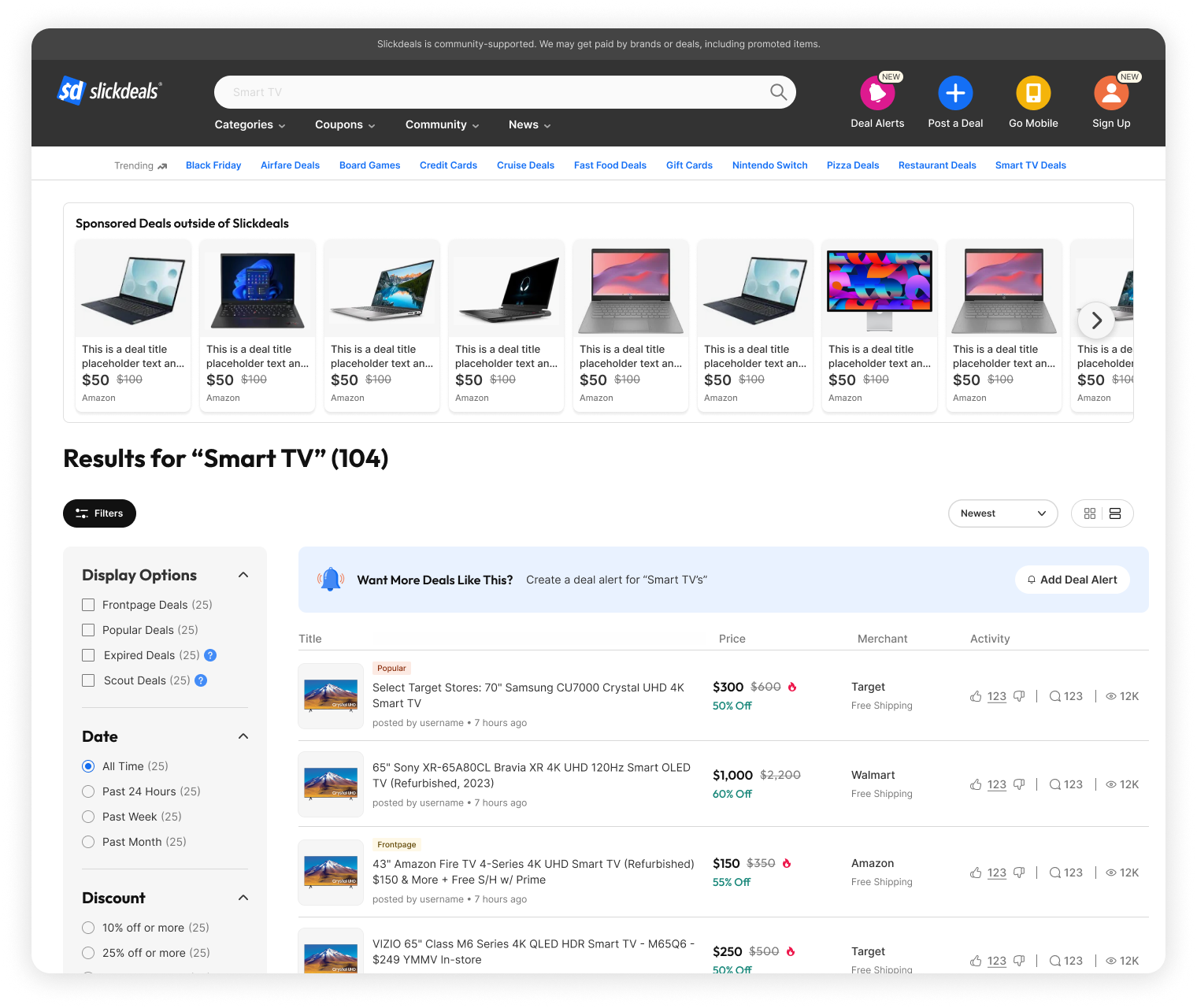
Search over the years -- Classic -> MVP Beta
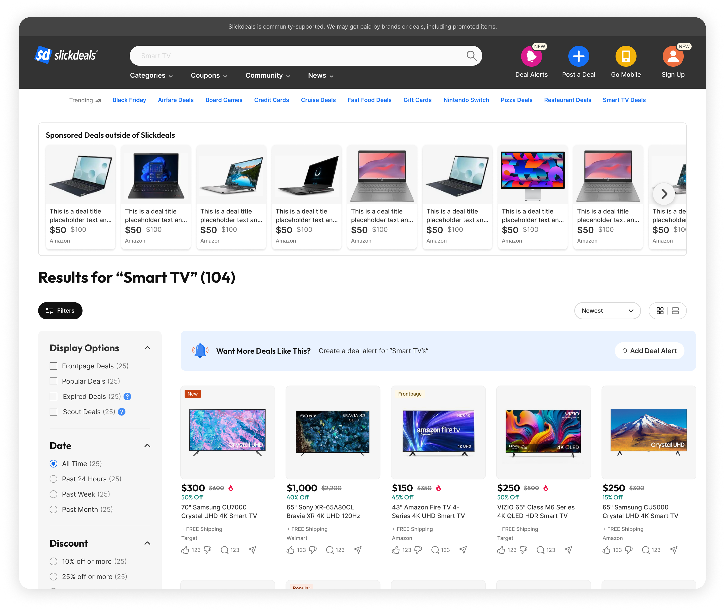
Search V1 Baseline
Strategy
Designing a smarter search journey from the very first interaction

Delivery
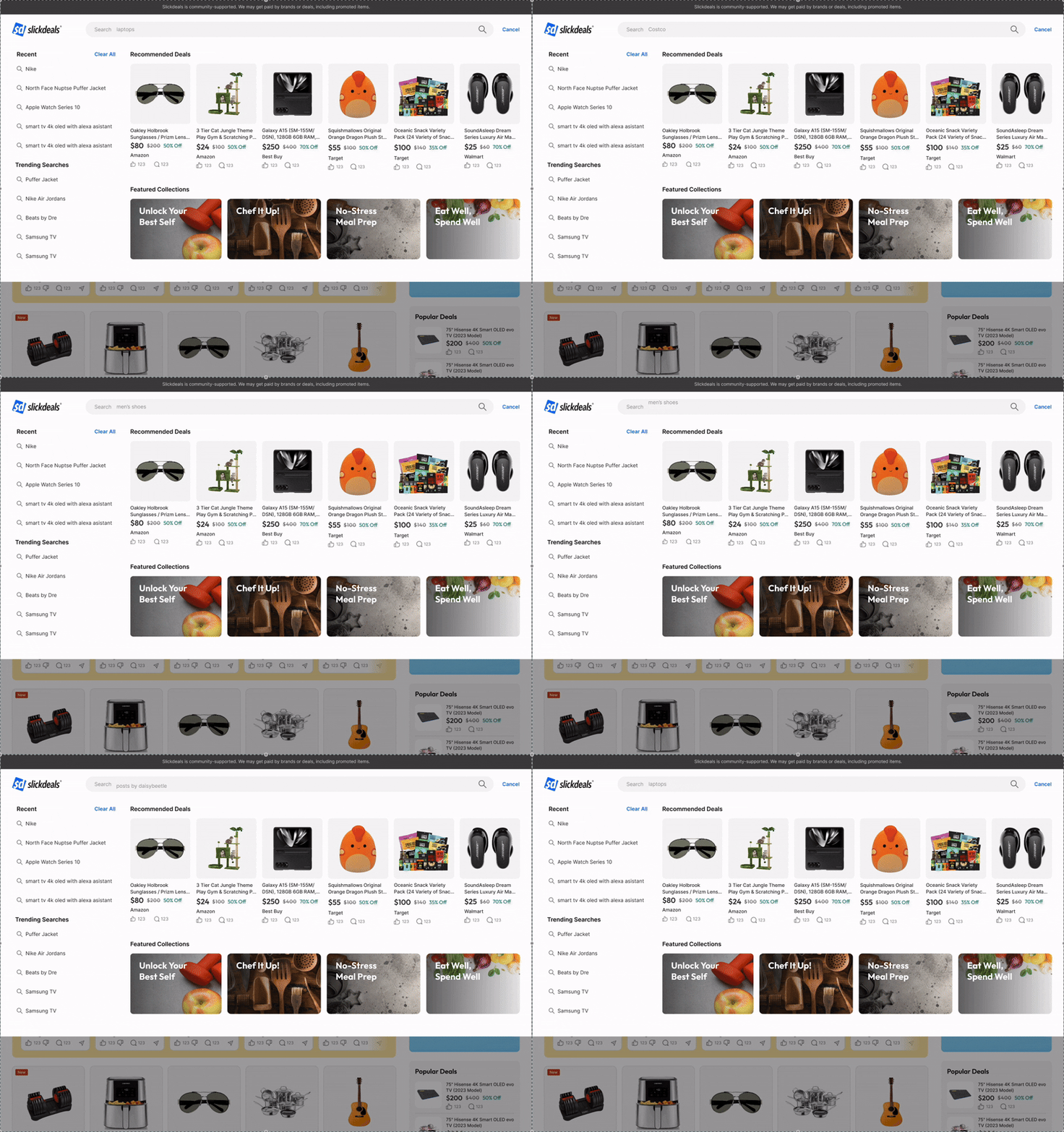
Bring Relevance to every step

Outcome
Search became a growth driver
Reflections
Lessons Learned
Taking over this project post-MVP taught me how to filter noise, focus on impact, and confidently drive direction even midstream.
- I inherited a firehose of user feedback, some constructive, some just noise. Learning to spot patterns, cut through the clutter, and make decisions based on what mattered most became one of the most valuable muscles I built on this project.
- Jumping in post-MVP was intimidating at first, but it gave me the freedom to question previous decisions and reframe the problem from a fresh perspective.
- One of the most meaningful wins was advocating for a redesigned search preview, it wasn’t on the original roadmap, but I made the case, and it changed the way users approached search from the start.
Up Next
Thanks For Reading
Thanks for taking the time to read this case study, I hope this gave you a clear look into how I approached a complex feature already in motion, identified the right opportunities, and pushed for design decisions that made an impact.
If you're curious to see more, feel free to check out my other case studies:
Work
Play
About
Resume
Slickdeals is a deal discovery platform with a passionate community of more than 12 million users. Browsing had always been the hero, while Search reached only about 4% of users. I took Search from early beta to general release and position it as a core entry point for discovery and conversion, driving search usage and revenue by 40%.
Search Redesign

Background
Slickdeals’ Sitewide Transformation
In Spring 2024, Slickdeals launched a limited beta of redesigned core experiences for select users. The goal was to modernize the platform, reach a younger audience, and improve retention and revenue. Search was part of that first release.

Search over the years -- Classic ->
Search V1 Baseline

Mininimalist + Modern
The new search experience had a cleaner, more modern and minimalist layout. With much more white space, users were able to focus more on the important details, deal results were easier to scan.
Grid View
Previously, search only provided results in a forum style list view. In this update we released a brand new grid view in search that brings ecommerce patterns to the surface. Results appear as product forward cards so people can scan images, prices, and key info quickly.


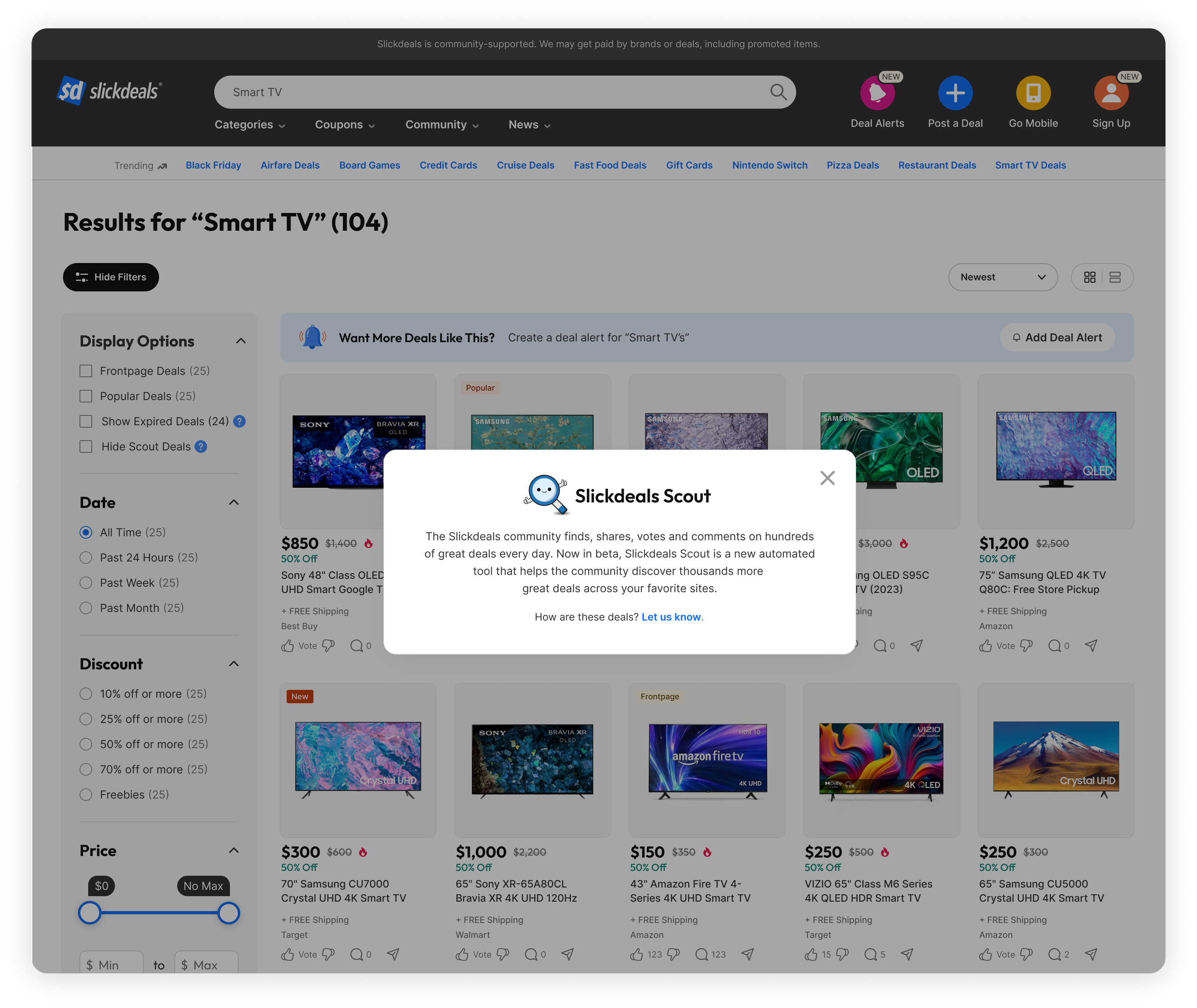
Scout Deals
For the first time we surfaced Scout deals alongside community posts. Scout is our automated tool that finds live offers across retailers, which increased coverage and kept results fresh so people could find a match more often.
Problem
Users Can’t Find What They’re Searching For
Strategy
Designing a smarter search journey from the very first interaction

Delivery
Bring Relevance to Every Step
Outcome
Search became a growth driver
Reflections
Lessons Learned
Taking over this project post-MVP taught me how to filter noise, focus on impact, and confidently drive direction even midstream.
- I inherited a firehose of user feedback, some constructive, some just noise. Learning to spot patterns, cut through the clutter, and make decisions based on what mattered most became one of the most valuable muscles I built on this project.
- Jumping in post-MVP was intimidating at first, but it gave me the freedom to question previous decisions and reframe the problem from a fresh perspective.
- One of the most meaningful wins was advocating for a redesigned search preview, it wasn’t on the original roadmap, but I made the case, and it changed the way users approached search from the start.
Up Next
Thanks For Reading
Thanks for taking the time to read this case study, I hope this gave you a clear look into how I approached a complex feature already in motion, identified the right opportunities, and pushed for design decisions that made an impact.
If you're curious to see more, feel free to check out my other case studies:
Tiffany Lim
Work
Play
About
Resume
Search Redesign
Slickdeals is a deal discovery platform with a passionate community of more than 12 million users. Browsing had always been the hero, while Search reached only about 4% of users. I took Search from early beta to general release and position it as a core entry point for discovery and conversion, driving search usage and revenue by 40%.

Background
Slickdeals’ Sitewide Transformation
In Spring 2024, Slickdeals launched a limited beta of redesigned core experiences for select users. The goal was to modernize the platform, reach a younger audience, and improve retention and revenue. Search was part of that first release.


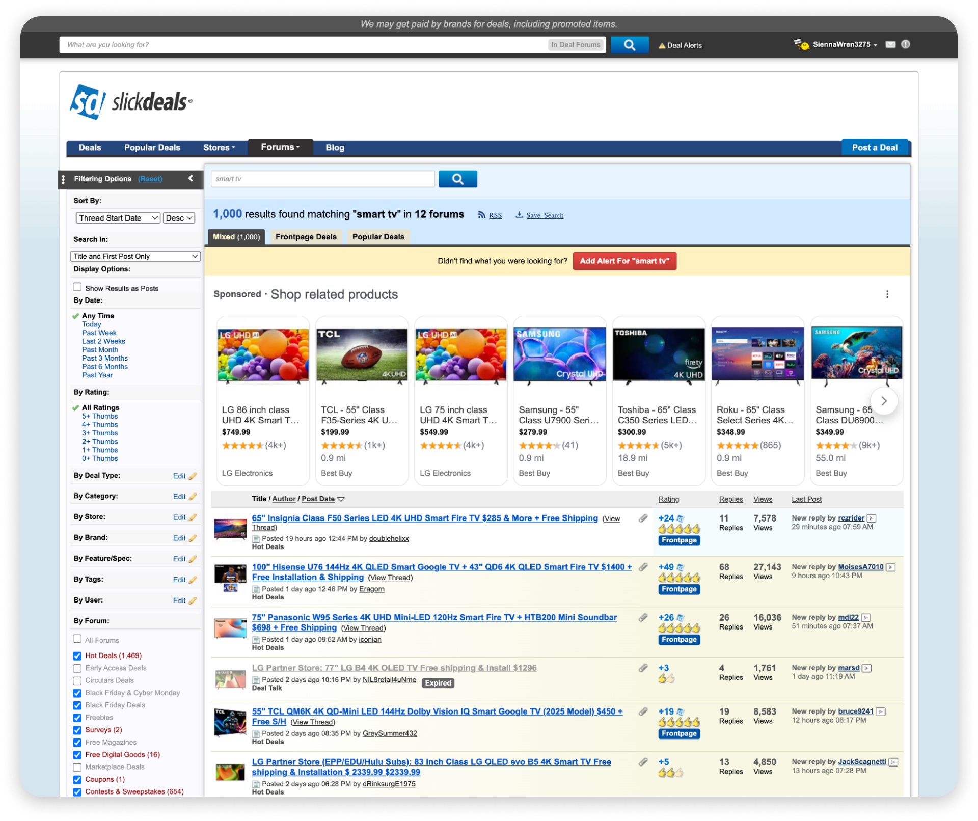
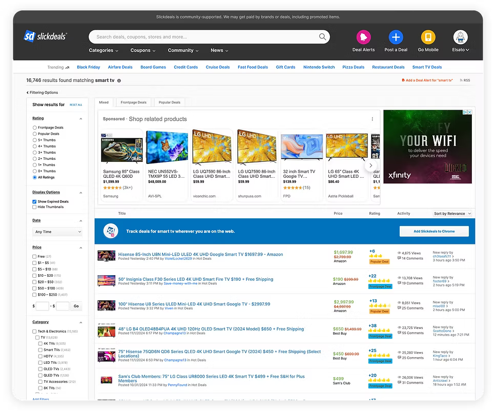
Search over the years -- Classic → Old Design → Search V1
Search V1 Baseline

Minimalist + Modern
The new search experience had a cleaner, more modern and minimalist layout. With much more white space, users were able to focus more on the important details, deal results were easier to scan.
Grid View
Previously, search only provided results in a forum style list view. In this update we released a brand new grid view in search that brings ecommerce patterns to the surface. Results appear as product forward cards so people can scan images, prices, and key info quickly.


Scout Deals
For the first time we surfaced Scout deals alongside community posts. Scout is our automated tool that finds live offers across retailers, which increased coverage and kept results fresh so people could find a match more often.
Problem
Users Can’t Find What They’re Searching For
Strategy
Designing a smarter search journey from the very first interaction

Delivery
Search V2

Capture more users
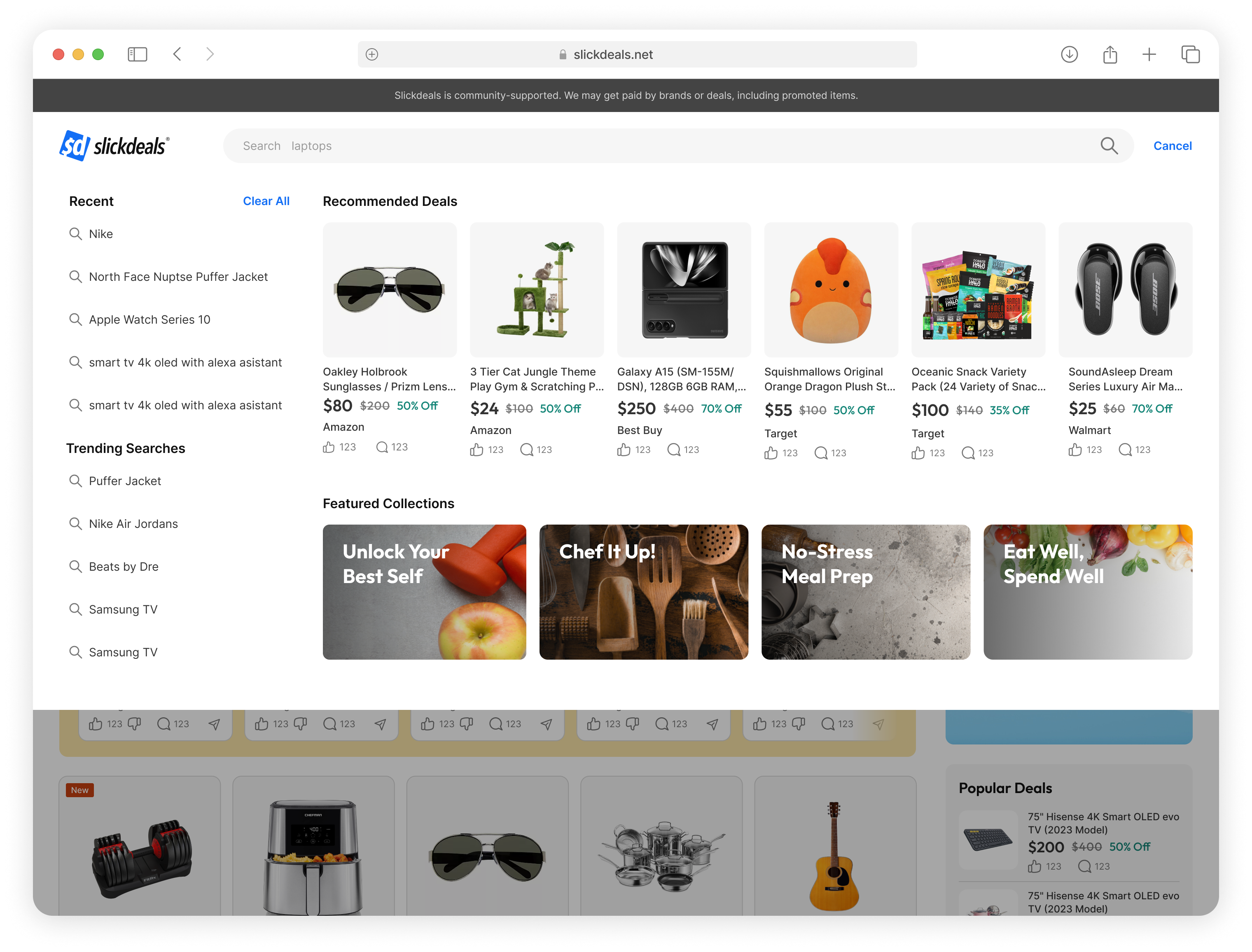
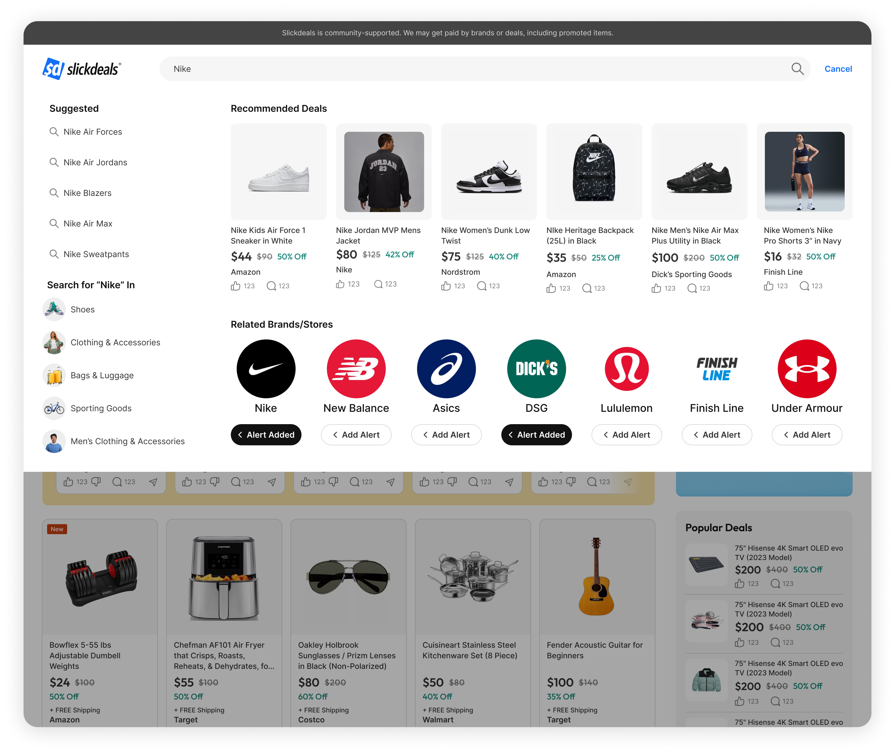
The search bar became a place to start. A dynamic placeholder cycles timely prompts that reflect what a person follows and what they looked at recently, then opens a full page preview on click. The preview surfaces recent searches and high intent suggestions, tailored to saved preferences without hiding exploration.
Autocomplete Guides the User
Autocomplete now acts like a guide. As you type, it elevates categories, brands, stores, and matching deals in one view. Suggestions are ordered by a gentle read of saved preferences and recent clicks, while community context stays visible on deal suggestions with votes and comment counts.


Transformed the search results page into a discovery hub
I redesigned the search results page to better reflect how users explore deals on Slickdeals, balancing both e-commerce and community content. In addition, modules for related categories, collections, brands, stores, and users were included to support discovery and keep users engaged.
Prevented dead ends
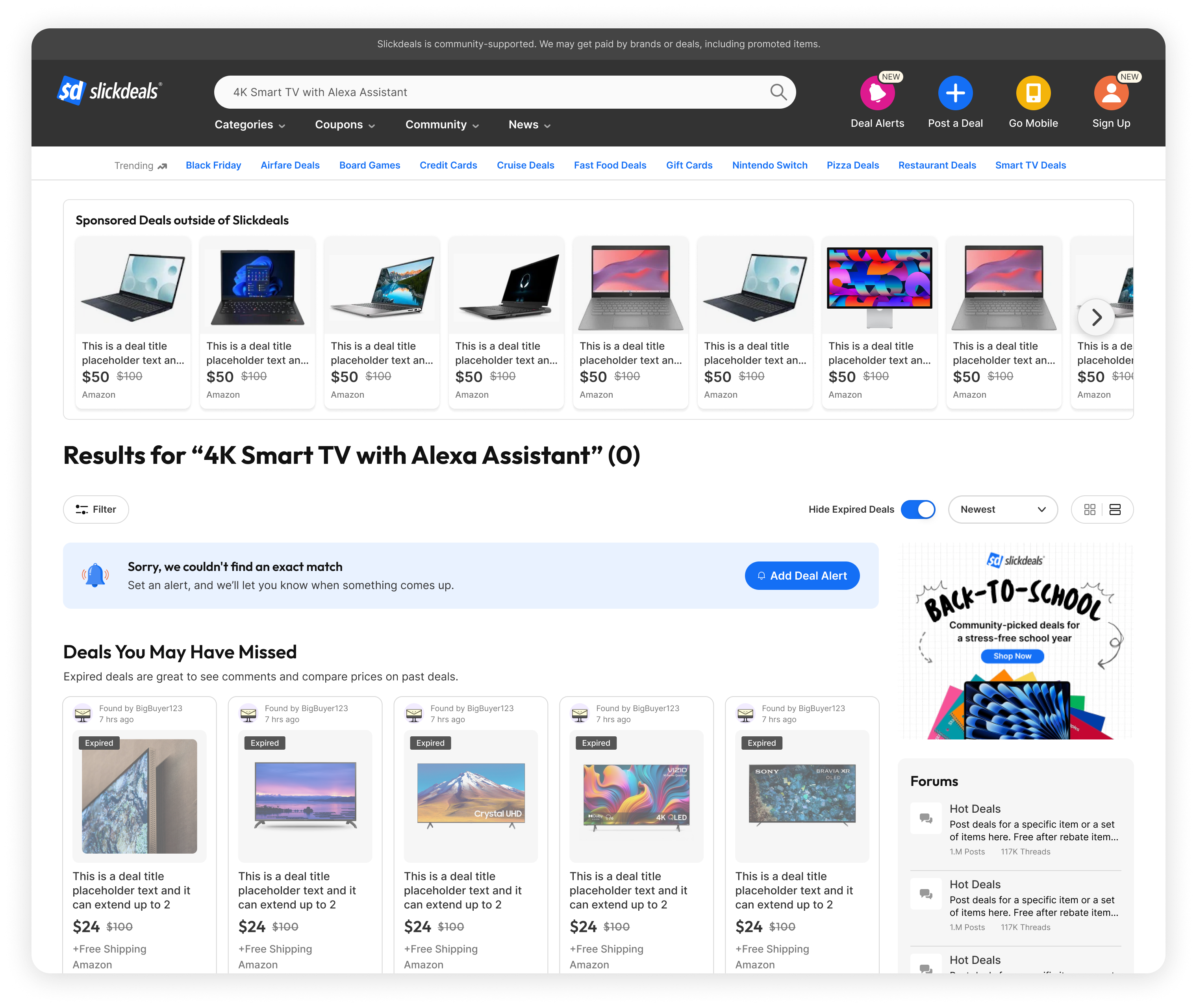
Thin or empty states move the session forward. We surface expired deals for research, offer related categories and brands to pivot, and present a Deal Alert that pre fills the query and preferred retailers. If personalization is steering too narrowly, a single tap widens the view so momentum never dies.

Outcome
Search became a growth driver
Reflections
Lessons Learned
Taking over this project post-MVP taught me how to filter noise, focus on impact, and confidently drive direction even midstream.
- I inherited a firehose of user feedback, some constructive, some just noise. Learning to spot patterns, cut through the clutter, and make decisions based on what mattered most became one of the most valuable muscles I built on this project.
- Jumping in post-MVP was intimidating at first, but it gave me the freedom to question previous decisions and reframe the problem from a fresh perspective.
- One of the most meaningful wins was advocating for a redesigned search preview, it wasn’t on the original roadmap, but I made the case, and it changed the way users approached search from the start.
Up Next
Thanks For Reading
Thanks for taking the time to read this case study, I hope this gave you a clear look into how I approached a complex feature already in motion, identified the right opportunities, and pushed for design decisions that made an impact.
If you're curious to see more, feel free to check out my other case studies:
