

Work
About
Contact


Community Growth Experiments
Faced with a multi-year decline in voting and commenting on Slickdeals, I led a quarter-long growth initiative to re-engage the community. Through a series of low-lift, high-impact experiments, I made voting feel more intuitive, rewarding, and fun. The result was a 30% lift in voting behavior and renewed momentum around community participation.
Role
Sr. Product Designer
Responsibilities
Product strategy
End to end design
Growth Experimentation
Timeline
3 Months
Impact at a glance
+30% increase in community engagment
Problem
A Decline in Community Engagement
From 2017 to 2023, Slickdeals experienced a steady decline in community engagement:
35%
Total votes dropped
25%
Decrease in unique voters
40%
Decline in Comments
By 2024, voter participation had dropped 10% year over year, continuing the downward trend. With the drop in votes and comments, fewer deals were reaching the front page, eventually lowering the criteria threshold for what qualified. Without votes and discussions, deals lost the trust signals that once made Slickdeals feel vibrant and community-driven. The site began to resemble a static feed, rather than the dynamic, user-powered space it used to be.
Challenge
Low Lift, High Impact
During this time, Slickdeals was undergoing a broader product transformation and engineering resources were limited. That meant any effort to improve voting had to be fast-moving and resource-conscious. As the growth designer, I focused on identifying high-impact, low-lift experiments that could be designed, built, and shipped within a sprint.
User Research + Insights
Understanding the Barriers to Community
Methods
To help us understand the user problems that led to the decline in our community, we conducted user interviews, observed behavioral data, and conducted competitive research.
Insights
Despite the community being a significant draw for Slickdeals, many users are unwilling or unsure how to become more active members of the community.
This behavior aligns with the common 90-9-1 rule of internet culture, where a small percentage of users actively create content, a slightly larger group engages with it, and the majority simply consume it without interaction.

Present, But Not Involved.
Some users treated Slickdeals as a one-way resource.
- Unregistered users often described a “parasocial” relationship with the community: happy to benefit, but hesitant to give back.
- Privacy concerns led some to avoid registering or posting out of fear their data would be shared.
How might we reduce the effort needed to participate, without compromising authenticity or trust?

Uncertain how to Contribute
Many users said they didn’t feel like they had anything “new” or “expert-level” to add.
- Some felt their comment would be redundant in active threads
- Others found the idea of posting deals intimidating
- Even seasoned users said they weren’t sure how to start
How might we help users feel their vote matters, even if they’re not a power user?
Lack of Time
Even longtime contributors reported voting and commenting less often because life got in the way.
- The act of participating felt like a time cost
- As personal priorities changed, engagement habits dropped off
How might we make voting and commenting feel enjoyable, personal, and worth their time?
These barriers weren’t just theoretical. Without votes, deals struggled to reach the front page, breaking the discovery loop that made the platform feel alive. Without comments, users lacked the context that once helped them decide if a deal was worth it.Despite the fact that site traffic remained high, the site felt more static and less human. This became a missed opportunity for a product built on community.
Delivery
A Series of Experiments
Despite the community being a significant draw for Slickdeals, many users are unwilling or unsure how to become more active members of the community.
This behavior aligns with the common 90-9-1 rule of internet culture, where a small percentage of users actively create content, a slightly larger group engages with it, and the majority simply consume it without interaction.
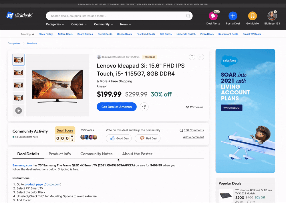
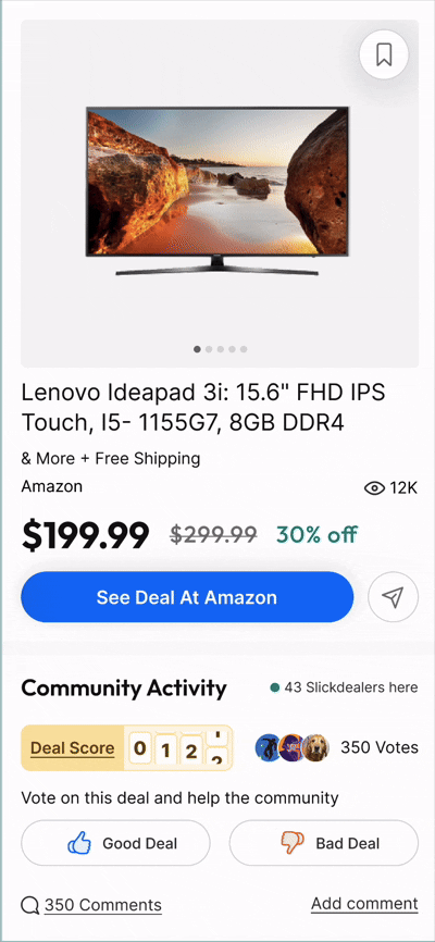
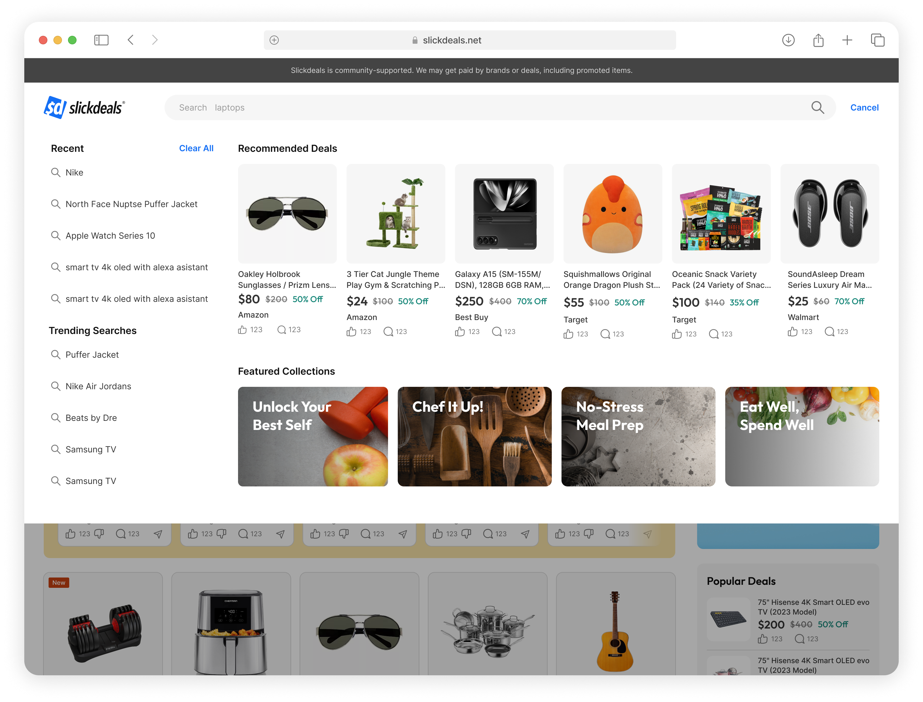
Helping Users Understand the Value of Their Vote
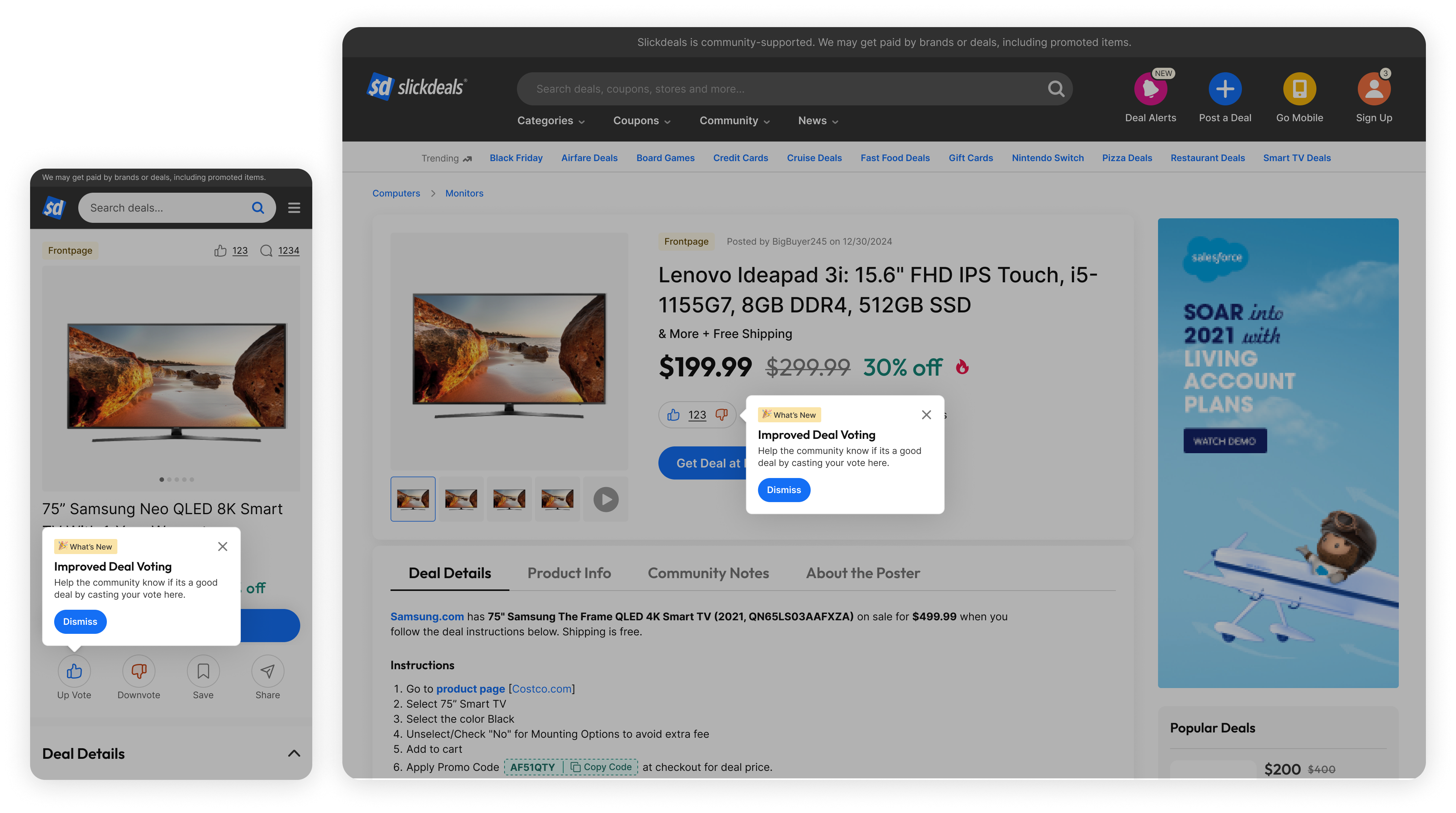
Although voting has always been a core part of Slickdeals, many users who weren’t deeply engaged with the community didn’t understand why voting mattered or what it actually did. In an attempt to educate users, we launched a takeover tooltip. It immediately drove more clicks and engagement...but it also led to some backlash. A development oversight meant the tooltip lacked logic to limit it to a single appearance per user, so users saw it over and over again. After the first exposure, what was meant to be helpful quickly became annoying, especially for users who were just trying to shop.
A development oversight meant the tooltip lacked logic to limit it to a single appearance per user, so users saw it over and over again. After the first exposure, what was meant to be helpful quickly became annoying, especially for users who were just trying to shop.
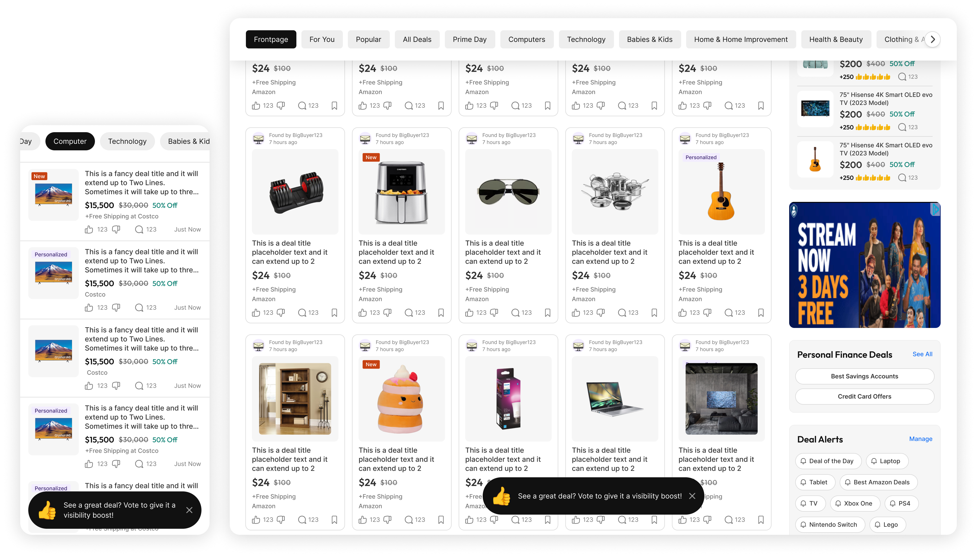
Based on our learnings from the tooltip takeover, I pivoted to a non-intrusive strategy: small, context-aware tooltips. These were lighter, better timed, and felt more intuitive to users. These subtle nudges better respected user intent, and in testing, we saw measurable improvements in voting.
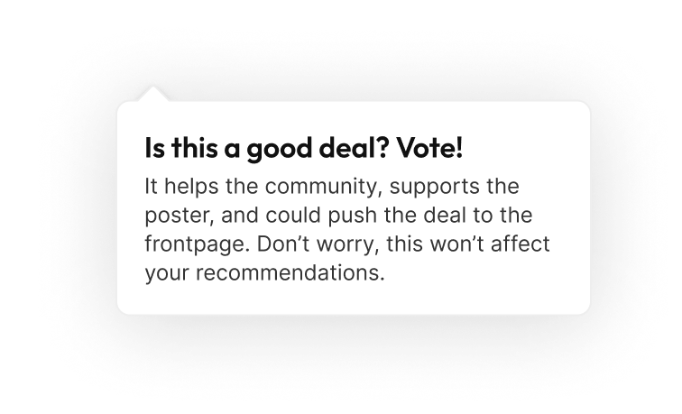
In addition to tooltips, we also rewrote copy across surfaces to make the purpose of voting clearer. For example, we changed vague labels like "Vote" to value-driven language such as "Help this deal reach the front page" or "Is this a good deal?". These subtle copy changes created better emotional and contextual relevance, leading to higher click-through on voting buttons.
These iterations showed that while education is necessary, timing, placement, and language are just as important. We learned from the initial misstep and used it to create a more respectful and effective approach that ultimately contributed to the 30% lift in voting behavior.
Meeting Users Where They’re Ready to Engage
We tested a takeover tooltip explaining how votes help surface great deals. It initially drove more clicks...but this also led to backlash. Due to a development oversight, the tooltip lacked logic to limit it to a single appearance per user. As a result, users were repeatedly exposed to the same message, which felt disruptive and overwhelming.
After reviewing user feedback, I pivoted to a non-intrusive strategy: small, context-aware tooltips that appeared only on hover or scroll. These were lighter, better timed, and felt more intuitive to users. We later tested a version that appeared just after deal engagement — for example, once a user viewed the price history or scrolled past the comments — and saw measurable improvements in voting on those pages.
In addition to tooltips, we also rewrote copy across surfaces to make the purpose of voting clearer. For example, we changed vague labels like "Vote" to value-driven language such as "Help this deal reach the front page" or "Is this a good deal?". These subtle copy changes created better emotional and contextual relevance, leading to higher click-through on voting buttons.
These iterations showed that while education is necessary, timing, placement, and language are just as important. We learned from the initial misstep and used it to create a more respectful and effective approach that ultimately contributed to the 30% lift in voting behavior.
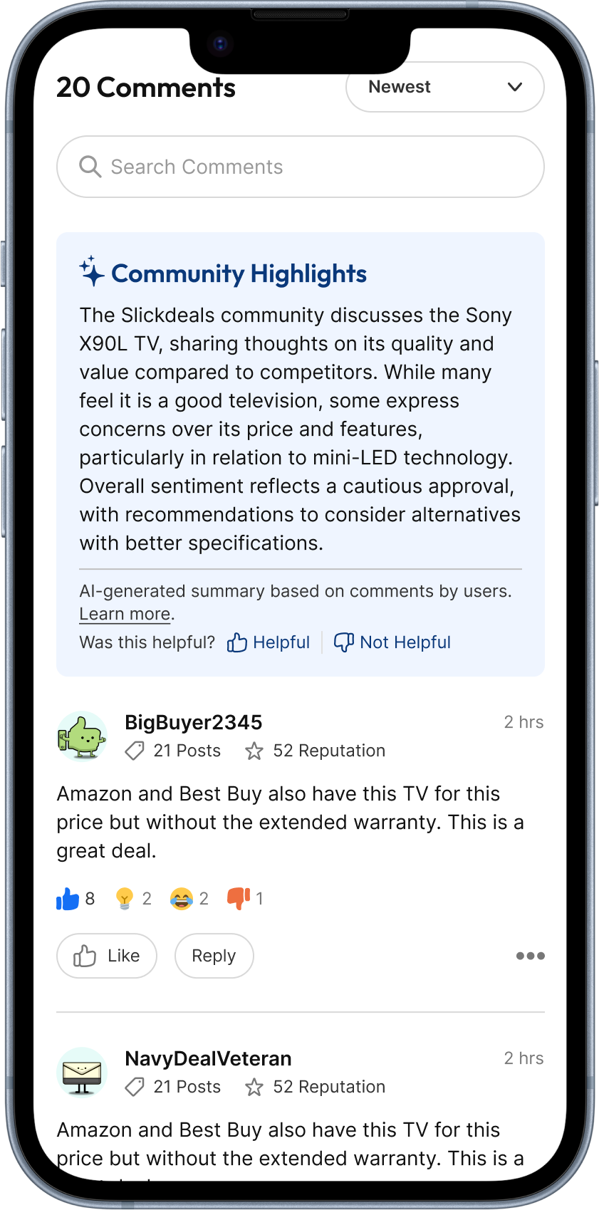
In addition, we also found that users are also more likely to engage on deals they did outclick on. We brought back the voting modal that appears when a user comes back to the deal details page after they view the deal. We also included a comment section in the modal so users can share their thoughts along with voting.

Making Participation Feel Fun and Social
We tested a takeover tooltip explaining how votes help surface great deals. It initially drove more clicks...but this also led to backlash. Due to a development oversight, the tooltip lacked logic to limit it to a single appearance per user. As a result, users were repeatedly exposed to the same message, which felt disruptive and overwhelming.
After reviewing user feedback, I pivoted to a non-intrusive strategy: small, context-aware tooltips that appeared only on hover or scroll. These were lighter, better timed, and felt more intuitive to users. We later tested a version that appeared just after deal engagement — for example, once a user viewed the price history or scrolled past the comments — and saw measurable improvements in voting on those pages.
In addition to tooltips, we also rewrote copy across surfaces to make the purpose of voting clearer. For example, we changed vague labels like "Vote" to value-driven language such as "Help this deal reach the front page" or "Is this a good deal?". These subtle copy changes created better emotional and contextual relevance, leading to higher click-through on voting buttons.
These iterations showed that while education is necessary, timing, placement, and language are just as important. We learned from the initial misstep and used it to create a more respectful and effective approach that ultimately contributed to the 30% lift in voting behavior.
Each of these experiments addressed specific barriers uncovered in research, from clarifying the purpose of voting, to making it feel fun, to placing it in moments when users were ready to engage. By aligning our design solutions with the real jobs users were trying to accomplish, we helped reinvigorate participation without overwhelming them.
Outcome
Did we move the needle?
Across all experiments, we drove a 30% increase in voting behavior, on a platform with over 12 million users. While not every experiment succeeded, each one mapped to a clear job users were trying to accomplish.
Lessons Learned
Reflections
The biggest lesson I took from this initiative? Try everything.
Working within so many constraints, it’s easy to feel like you have to play it safe, to only share your best idea, to anticipate what might get shut down, or to edit yourself too early. But growth design thrives on momentum. It’s not about finding the perfect solution on the first try. It’s about exploring broadly, testing rapidly, and learning constantly. Some ideas landed. Others didn’t. That’s the point.
Conducting these experiments taught me that it’s just as important to know when to scale backas it is to push forward. You can’t optimize what you haven’t explored. Real growth comes from thoughtful experimentation, trying enough ideas to find the ones worth keeping, then refining them with care.
Up Next
Thanks For Reading
Thanks for taking the time to read this case study, I hope it gave you a glimpse into how thoughtful design and scrappy experimentation can drive real impact.
If you're curious to see more, feel free to check out my other case studies:


Slickdeals Search Redesign

AI Comment Summary
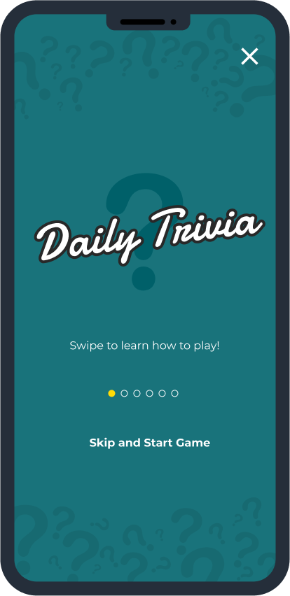
Swagbucks Live Daily Trivia
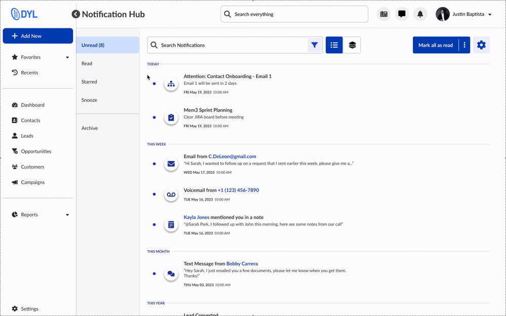


Notifications System

Work

Play
About
Resume
Community Growth Experiments
Faced with a multi-year decline in voting and commenting on Slickdeals, I led a quarter-long growth initiative to re-engage the community. Through a series of low-lift, high-impact experiments, I made voting feel more intuitive, rewarding, and fun. The result was a 30% lift in voting behavior and renewed momentum around community participation.
Role
Sr. Product Designer
Responsibilities
Product strategy
End to end design
Growth Experimentation
Timeline
3 Months
Impact at a glance
+30% increase in community engagment
Problem
A Decline in Community Engagement
From 2017 to 2023, Slickdeals experienced a steady decline in community engagement:
35%
Total votes dropped
25%
Decrease in unique voters
40%
Decline in Comments
By 2024, voter participation had dropped 10% year over year, continuing the downward trend. With the drop in votes and comments, fewer deals were reaching the front page, eventually lowering the criteria threshold for what qualified. Without votes and discussions, deals lost the trust signals that once made Slickdeals feel vibrant and community-driven. The site began to resemble a static feed, rather than the dynamic, user-powered space it used to be.
Challenge
Low Lift, High Impact
During this time, Slickdeals was undergoing a broader product transformation and engineering resources were limited. That meant any effort to improve voting had to be fast-moving and resource-conscious. As the growth designer, I focused on identifying high-impact, low-lift experiments that could be designed, built, and shipped within a sprint.
User Research + Insights
Understanding the Barriers to Community
Insights
Despite the community being a significant draw for Slickdeals, many users are unwilling or unsure how to become more active members of the community.
This behavior aligns with the common 90-9-1 rule of internet culture, where a small percentage of users actively create content, a slightly larger group engages with it, and the majority simply consume it without interaction.
Methods
To help us understand the user problems that led to the decline in our community, we conducted user interviews, observed behavioral data, and conducted competitive research.
Present, But Not Involved.
Some users treated Slickdeals as a one-way resource.
- Unregistered users often described a “parasocial” relationship with the community: happy to benefit, but hesitant to give back.
- Privacy concerns led some to avoid registering or posting out of fear their data would be shared.
How might we reduce the effort needed to participate, without compromising authenticity or trust?
Uncertain how to Contribute
Many users said they didn’t feel like they had anything “new” or “expert-level” to add.
- Some felt their comment would be redundant in active threads
- Others found the idea of posting deals intimidating
- Even seasoned users said they weren’t sure how to start
How might we help users feel their vote matters, even if they’re not a power user?
Lack of Time
Even longtime contributors reported voting and commenting less often because life got in the way.
- The act of participating felt like a time cost
- As personal priorities changed, engagement habits dropped off
How might we make voting and commenting feel enjoyable, personal, and worth their time?
These barriers weren’t just theoretical. Without votes, deals struggled to reach the front page, breaking the discovery loop that made the platform feel alive. Without comments, users lacked the context that once helped them decide if a deal was worth it.Despite the fact that site traffic remained high, the site felt more static and less human. This became a missed opportunity for a product built on community.
Delivery
A Series of Experiments
Despite the community being a significant draw for Slickdeals, many users are unwilling or unsure how to become more active members of the community.
This behavior aligns with the common 90-9-1 rule of internet culture, where a small percentage of users actively create content, a slightly larger group engages with it, and the majority simply consume it without interaction.
Helping Users Understand the Value of Their Vote
Although voting has always been a core part of Slickdeals, many users who weren’t deeply engaged with the community didn’t understand why voting mattered or what it actually did. In an attempt to educate users, we launched a takeover tooltip. It immediately drove more clicks and engagement...but it also led to some backlash. A development oversight meant the tooltip lacked logic to limit it to a single appearance per user, so users saw it over and over again. After the first exposure, what was meant to be helpful quickly became annoying, especially for users who were just trying to shop.
A development oversight meant the tooltip lacked logic to limit it to a single appearance per user, so users saw it over and over again. After the first exposure, what was meant to be helpful quickly became annoying, especially for users who were just trying to shop.
Based on our learnings from the tooltip takeover, I pivoted to a non-intrusive strategy: small, context-aware tooltips. These were lighter, better timed, and felt more intuitive to users. These subtle nudges better respected user intent, and in testing, we saw measurable improvements in voting.
In addition to tooltips, we also rewrote copy across surfaces to make the purpose of voting clearer. For example, we changed vague labels like "Vote" to value-driven language such as "Help this deal reach the front page" or "Is this a good deal?". These subtle copy changes created better emotional and contextual relevance, leading to higher click-through on voting buttons.
These iterations showed that while education is necessary, timing, placement, and language are just as important. We learned from the initial misstep and used it to create a more respectful and effective approach that ultimately contributed to the 30% lift in voting behavior.
Meeting Users Where They’re Ready to Engage
Heatmaps showed that users were more likely to vote after learning more about the deal. So we added floating bar on deal detail pages, easily accessible without needing to scroll back to the top. This change resulted in higher engagement in the right place, at the right time.
In addition, we also found that users are also more likely to engage on deals they did outclick on. We brought back the voting modal that appears when a user comes back to the deal details page after they view the deal. We also included a comment section in the modal so users can share their thoughts along with voting.
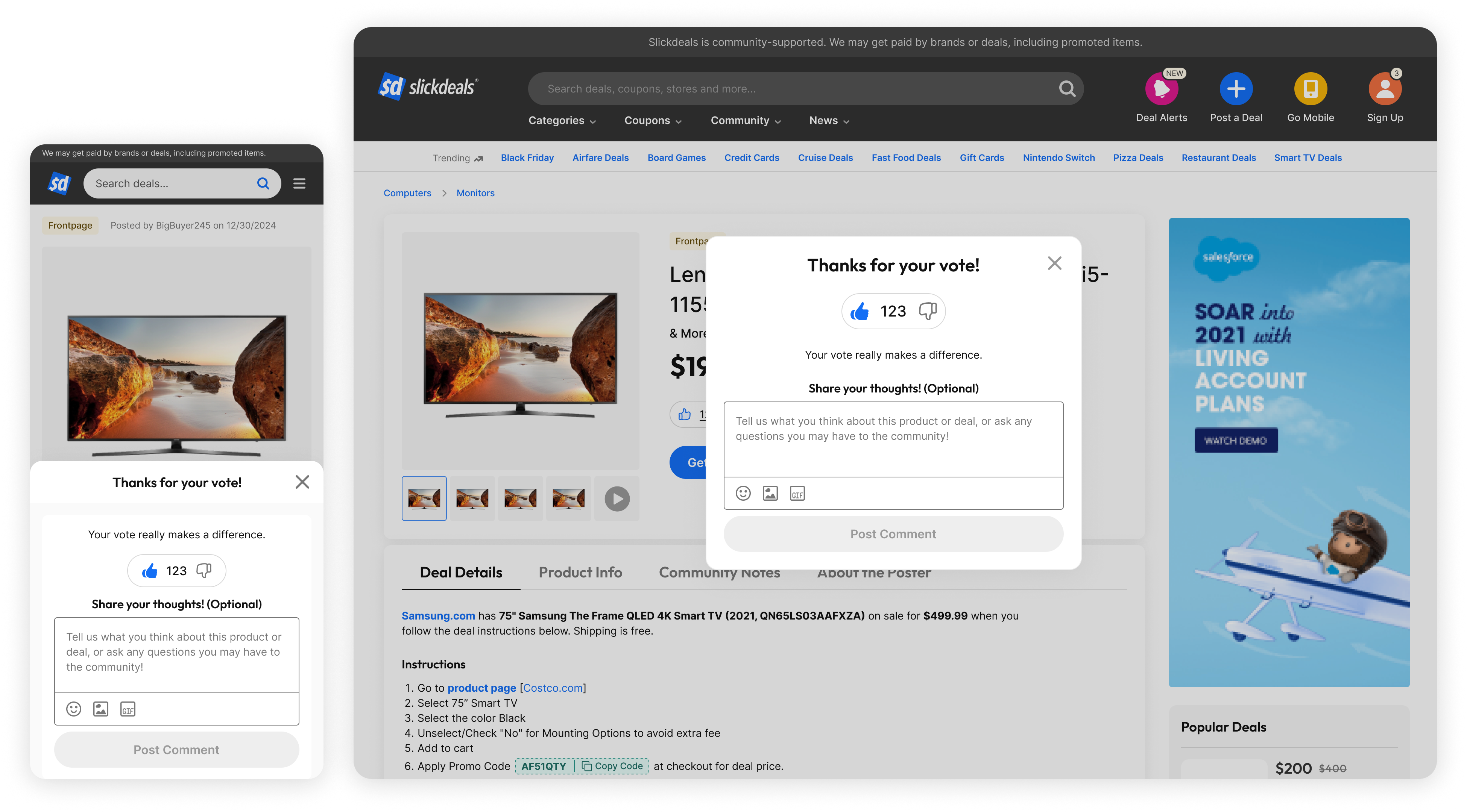
Making Participation Feel Fun and Social
We reimagined voting as something fun and social by introducing playful microinteractions and reframing it as a community-driven action. We also tested a new layout on the deal details page that gave community activity its own dedicated module. The goal was to make this block feel dynamic and engaging, surfacing real-time social proof and showing that real users were actively voting, commenting, and participating.
Each of these experiments addressed specific barriers uncovered in research, from clarifying the purpose of voting, to making it feel fun, to placing it in moments when users were ready to engage. By aligning our design solutions with the real jobs users were trying to accomplish, we helped reinvigorate participation without overwhelming them.
Outcome
Did we move the needle?
Across all experiments, we drove a 30% increase in voting behavior, on a platform with over 12 million users. While not every experiment succeeded, each one mapped to a clear job users were trying to accomplish.
Lessons Learned
Reflections
The biggest lesson I took from this initiative? Try everything.
Working within so many constraints, it’s easy to feel like you have to play it safe, to only share your best idea, to anticipate what might get shut down, or to edit yourself too early. But growth design thrives on momentum. It’s not about finding the perfect solution on the first try. It’s about exploring broadly, testing rapidly, and learning constantly. Some ideas landed. Others didn’t. That’s the point.
Conducting these experiments taught me that it’s just as important to know when to scale backas it is to push forward. You can’t optimize what you haven’t explored. Real growth comes from thoughtful experimentation, trying enough ideas to find the ones worth keeping, then refining them with care.
Up Next
Thanks For Reading
Thanks for taking the time to read this case study, I hope it gave you a glimpse into how thoughtful design and scrappy experimentation can drive real impact.
If you're curious to see more, feel free to check out my other case studies:
Slickdeals Search Redesign
AI Comment Summary
Swagbucks Live Daily Trivia
Notifications System
Work
Play
About
Resume
Community Growth Experiments
Faced with a multi-year decline in voting and commenting on Slickdeals, I led a quarter-long growth initiative to re-engage the community. Through a series of low-lift, high-impact experiments, I made voting feel more intuitive, rewarding, and fun. The result was a 30% lift in voting behavior and renewed momentum around community participation.
Role
Sr. Product Designer
Responsibilities
Product strategy
End to end design
Growth Experimentation
Timeline
3 Months
Impact at a glance
+30% increase in community engagment
Problem
A Decline in Community Engagement
From 2017 to 2023, Slickdeals experienced a steady decline in community engagement:
35%
Total votes dropped
25%
Decrease in unique voters
40%
Decline in Comments
By 2024, voter participation had dropped 10% year over year, continuing the downward trend. With the drop in votes and comments, fewer deals were reaching the front page, eventually lowering the criteria threshold for what qualified. Without votes and discussions, deals lost the trust signals that once made Slickdeals feel vibrant and community-driven. The site began to resemble a static feed, rather than the dynamic, user-powered space it used to be.
Challenge
Low Lift, High Impact
During this time, Slickdeals was undergoing a broader product transformation and engineering resources were limited. That meant any effort to improve voting had to be fast-moving and resource-conscious. As the growth designer, I focused on identifying high-impact, low-lift experiments that could be designed, built, and shipped within a sprint.
User Research + Insights
Understanding the Barriers to Community
Methods
To help us understand the user problems that led to the decline in our community, we conducted user interviews, observed behavioral data, and conducted competitive research.
Insights
Despite the community being a significant part of Slickdeals, many users are unwilling or unsure how to become more active members of the community. This behavior aligns with the common 90-9-1 rule of internet culture, where a small percentage of users actively create content, a slightly larger group engages with it, and the majority simply consume it without interaction. In addition, our 3 major barriers for community engagement were uncovered:
Present, But Not Involved.
Some users treated Slickdeals as a one-way resource.
- Unregistered users often described a “parasocial” relationship with the community: happy to benefit, but hesitant to give back.
- Privacy concerns led some to avoid registering or posting out of fear their data would be shared.
How might we reduce the effort needed to participate, without compromising authenticity or trust?
Uncertain how to Contribute
Many users said they didn’t feel like they had anything “new” or “expert-level” to add.
- Some felt their comment would be redundant in active threads
- Others found the idea of posting deals intimidating
- Even seasoned users said they weren’t sure how to start
How might we help users feel their vote matters, even if they’re not a power user?
Lack of Time
Even longtime contributors reported voting and commenting less often because life got in the way.
- The act of participating felt like a time cost
- As personal priorities changed, engagement habits dropped off
How might we make voting and commenting feel enjoyable, personal, and worth their time?
These barriers weren’t just theoretical. Without votes, deals struggled to reach the front page, breaking the discovery loop that made the platform feel alive. Without comments, users lacked the context that once helped them decide if a deal was worth it.Despite the fact that site traffic remained high, the site felt more static and less human. This became a missed opportunity for a product built on community.
Delivery
A Series of Experiments
With those needs in mind, we designed a series of targeted experiments. Each was crafted to nudge users toward participation in a way that felt timely, intuitive, and aligned with the context they were in, whether they were browsing, looking for deal validation, or just short on time.
Helping Users Understand the Value of Their Vote
Although voting has always been a core part of Slickdeals, many users who weren’t deeply engaged with the community didn’t understand why voting mattered or what it actually did. In an attempt to educate users, we launched a takeover tooltip. It immediately drove more clicks and engagement...but it also led to some backlash.
A development oversight meant the tooltip lacked logic to limit it to a single appearance per user, so users saw it over and over again. After the first exposure, what was meant to be helpful quickly became annoying, especially for users who were just trying to shop.
Based on our learnings from the tooltip takeover, I pivoted to a non-intrusive strategy: small, context-aware tooltips. These were lighter, better timed, and felt more intuitive to users. These subtle nudges better respected user intent, and in testing, we saw measurable improvements in voting.
In addition to tooltips, we also rewrote copy across surfaces to make the purpose of voting clearer. For example, we changed vague labels like "Vote" to value-driven language such as "Help this deal reach the front page" or "Is this a good deal?". These subtle copy changes created better emotional and contextual relevance, leading to higher click-through on voting buttons.
These iterations showed that while education is necessary, timing, placement, and language are just as important. We learned from the initial misstep and used it to create a more respectful and effective approach that ultimately contributed to the 30% lift in voting behavior.
Meeting Users Where They’re Ready to Engage
Heatmaps showed that users were more likely to vote after learning more about the deal. So we added floating bar on deal detail pages, easily accessible without needing to scroll back to the top. This change resulted in higher engagement in the right place, at the right time.
In addition, we also found that users are also more likely to engage on deals they did outclick on. We brought back the voting modal that appears when a user comes back to the deal details page after they view the deal. We also included a comment section in the modal so users can share their thoughts along with voting.
Making Participation Feel Fun and Social
We reimagined voting as something fun and social by introducing playful microinteractions and reframing it as a community-driven action. We also tested a new layout on the deal details page that gave community activity its own dedicated module. The goal was to make this block feel dynamic and engaging, surfacing real-time social proof and showing that real users were actively voting, commenting, and participating.
Each of these experiments addressed specific barriers uncovered in research, from clarifying the purpose of voting, to making it feel fun, to placing it in moments when users were ready to engage. By aligning our design solutions with the real jobs users were trying to accomplish, we helped reinvigorate participation without overwhelming them.
Outcome
Did we move the needle?
Across all experiments, we drove a 30% increase in voting behavior, on a platform with over 12 million users. While not every experiment succeeded, each one mapped to a clear job users were trying to accomplish.
Lessons Learned
Reflections
The biggest lesson I took from this initiative? Try everything.
Working within so many constraints, it’s easy to feel like you have to play it safe, to only share your best idea, to anticipate what might get shut down, or to edit yourself too early. But growth design thrives on momentum. It’s not about finding the perfect solution on the first try. It’s about exploring broadly, testing rapidly, and learning constantly. Some ideas landed. Others didn’t. That’s the point.
Conducting these experiments taught me that it’s just as important to know when to scale backas it is to push forward. You can’t optimize what you haven’t explored. Real growth comes from thoughtful experimentation, trying enough ideas to find the ones worth keeping, then refining them with care.
Up Next
Thanks For Reading
Thanks for taking the time to read this case study, I hope it gave you a glimpse into how thoughtful design and scrappy experimentation can drive real impact.
If you're curious to see more, feel free to check out my other case studies:
Slickdeals Search Redesign
AI Comment Summary
Swagbucks Live Daily Trivia
Notifications System