

Work
About
Contact


Notifications System
Built a centralized notification hub for a VoIP/CRM platform to help users manage leads, reduce missed actions, and improve follow-up efficiency.
Role
Lead Product Designer
Timeline
2 Months
Impact at a glance
80% fewer missed alerts reported
As part of the DYL 2.0 platform team, I led the design of the company’s first complete Notification System, introducing a centralized, actionable experience to help sales reps stay on top of time-sensitive updates. I independently designed the Notification Hub, drove UX strategy across the system, and contributed to the Notification Center and Settings through critique and collaboration. Internal testing showed strong adoption and significantly fewer missed updates. My work brought structure and clarity to a critical part of the user experience that didn’t exist before.
The Problem
Scattered alerts, missed updates, no control
In DYL 1.0, users had no true way to manage notifications. Alerts were scattered across different parts of the interface, often buried or easy to miss. Many users depended on timely information to follow up on leads, but reported frustration with unclear visibility, low-priority noise, and no way to filter or take quick action.
The challenge: design a system from scratch that helped users understand what changed, what mattered, and what to do next.
User Research
Grounded in user needs, guided by industry insight
To design a notification system that truly fit DYL users’ workflows, we needed to understand both their goals and their pain points. We approached this from three angles: user personas, direct and indirect research, and competitive analysis.
Who we’re designing for
We started by building on existing research from the marketing team, identifying three primary user groups we needed to serve:
Business Owners/Managers

Entrepreneurs and operational leaders focused on driving revenue, retaining customers, and optimizing internal efficiency.
Marketing Professionals

Leads and specialists responsible for campaign execution, lead generation, and audience engagement, particularly via SEO and social media.
Service Providers

Busy professionals like contractors, medical practitioners, and legal experts who rely on DYL to streamline communications and nurture client relationships.
What we learned from research and feedback
To dig deeper into user behavior, we synthesized findings across multiple research methods:
Indirect Feedback: We worked with our customer accounts team to identify the most common questions, complaints, and requests related to notifications.
- Internal Interviews: We conducted interviews with DYL staff from sales, marketing, and support. These were people who both used the product and spoke to customers daily.
- Design Audit of DYL 1.0: We reviewed the current notification experience (or lack thereof) to identify gaps and friction.
- Secondary Research: We studied notification best practices from modern SaaS products to understand what’s become standard, expected, or innovative.

Key insights:
- Users struggled without a centralized hub, they had no clear way to track important activity.
- Customization was in high demand. Users wanted to control what they saw to stay focused and reduce noise.
- The absence of automation led to missed updates, creating frustration and lost opportunities.
- Users needed a lightweight way to stay informed without manually checking multiple places.
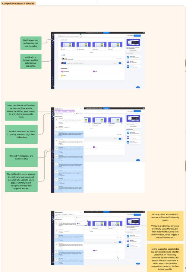
Where DYL stands in the competitive landscape
We also conducted a competitive analysis of VoIP and CRM platforms to understand how other tools handled notifications and surfaced time-sensitive information
Indirect Feedback: We worked with our customer accounts team to identify the most common questions, complaints, and requests related to notifications.
- Internal Interviews: We conducted interviews with DYL staff from sales, marketing, and support. These were people who both used the product and spoke to customers daily.
- Design Audit of DYL 1.0: We reviewed the current notification experience (or lack thereof) to identify gaps and friction.
- Secondary Research: We studied notification best practices from modern SaaS products to understand what’s become standard, expected, or innovative.
To dig deeper into user behavior, we synthesized findings across multiple research methods:
- Indirect Feedback: We worked with our customer accounts team to identify the most common questions, complaints, and requests related to notifications.
- Internal Interviews: We conducted interviews with DYL staff from sales, marketing, and support. These were people who both used the product and spoke to customers daily.
- Design Audit of DYL 1.0: We reviewed the current notification experience (or lack thereof) to identify gaps and friction.
- Secondary Research: We studied notification best practices from modern SaaS products to understand what’s become standard, expected, or innovative.
Key takeaways:
- Prioritize intuitive UX: Platforms like monday.com and HubSpot use clear information hierarchies and clean UI to reduce user friction and improve engagement.
- Give users control: Zoho emphasizes customizable notification preferences, a key feature that helps users feel in control and prevents alert fatigue.
- Make notifications actionable: Monday.com stood out for letting users complete actions directly from alerts, which helped minimize context-switching.
- Stay adaptable: Continuous iteration based on feedback was a recurring pattern in modern CRM systems, and something we wanted to reflect in the foundation of DYL 2.0.
User Resarch
Scattered alerts, missed updates, no control
Following our research, we aligned as a team on the key principles that would shape the Notification System, with a strong emphasis on visibility, control, and reducing friction for busy users.
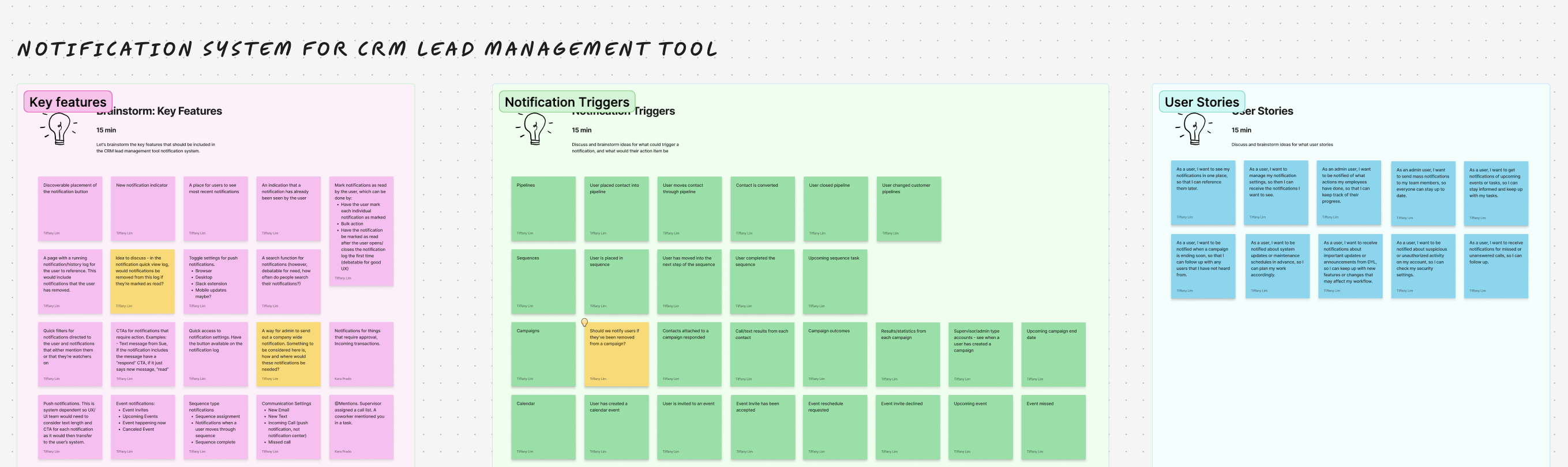
We kicked off the design phase with a collaborative FigJam session between myself and the other designer to align on the scope and structure of the system. Together, we mapped out key features, notification types, their triggers, and associated workflows. We also explored potential user stories across our core personas to stress-test different use cases. This early work helped us define how each type of notification should behave, where it should appear, and what actions users should be able to take — laying the groundwork for our user flows and wireframes.
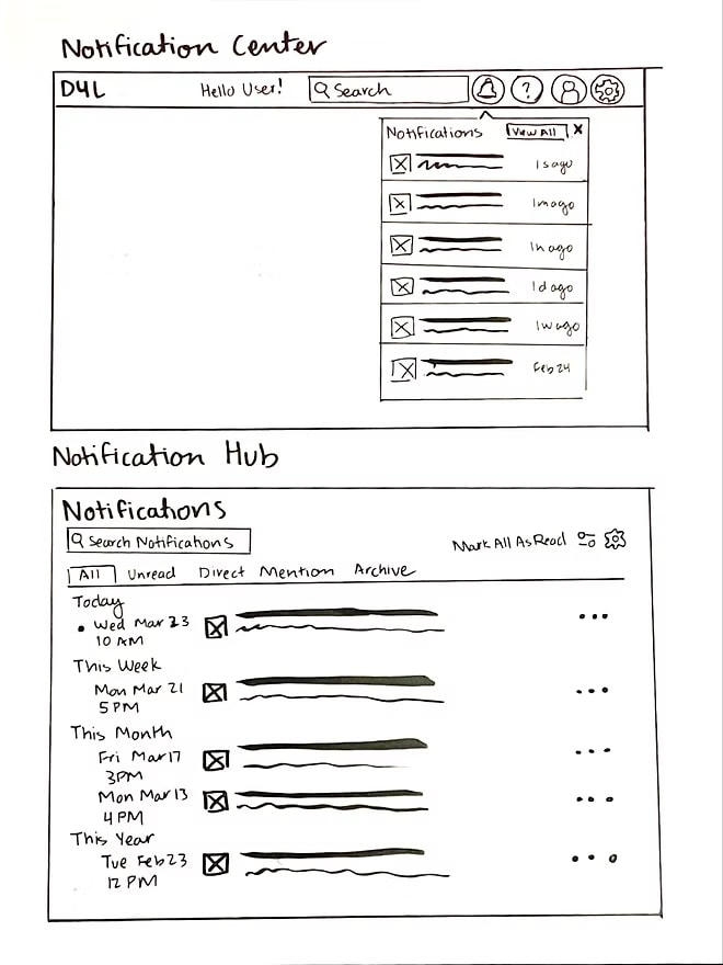
As we clarified system behavior, I explored different layout directions through rapid sketches, thinking through entry points, grouping models, and hover interactions. These low-fidelity sketches helped shape early concepts for both the Notification system.
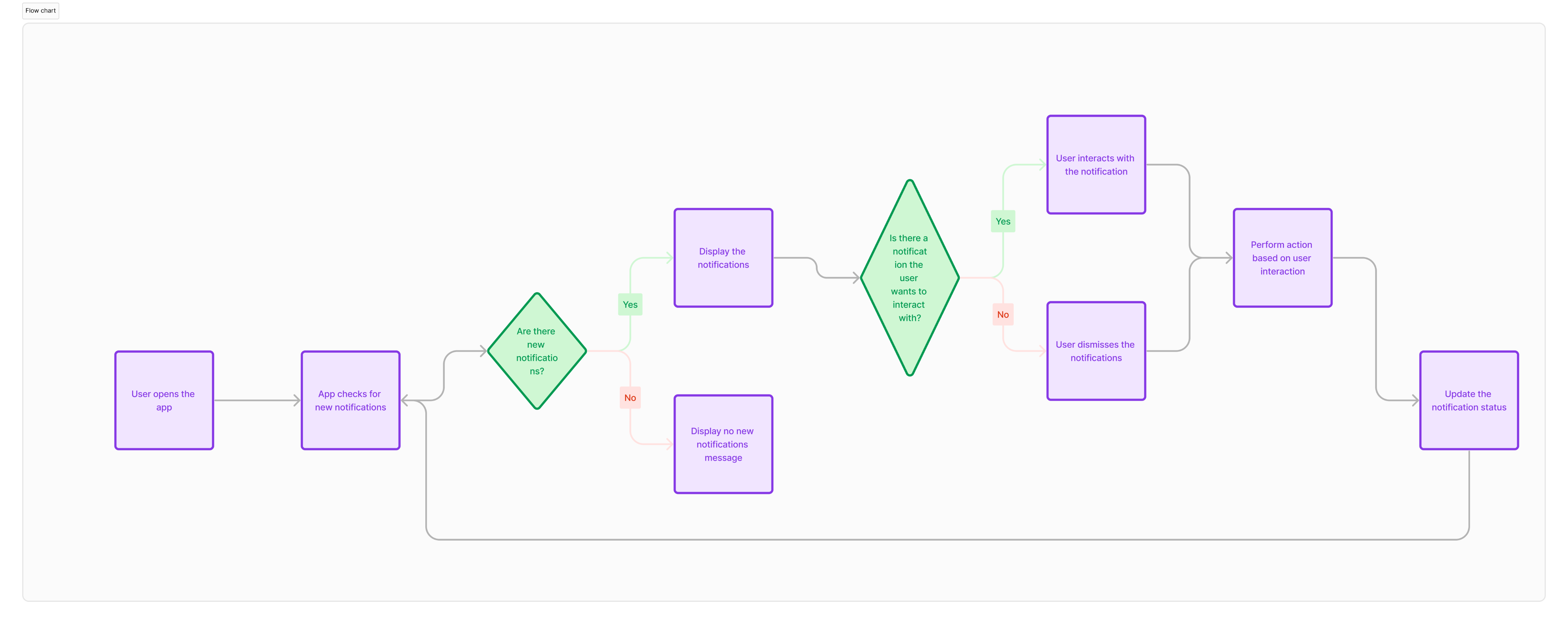
From there, I created user flows to visualize how notifications would move across the platform, from when and where they were triggered to how users could take action. This included logic for the Hub, Center, and Settings, ensuring a clear path from alert to resolution.
I then led the wireframe design across the system, using it to test layout, hierarchy, and interaction patterns. These early mockups also helped us gather early feedback from engineering, ensuring feasibility and flexibility before moving into visual design and dev handoff.
Scattered alerts, missed updates, no control
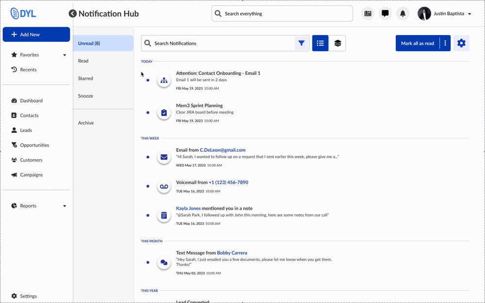
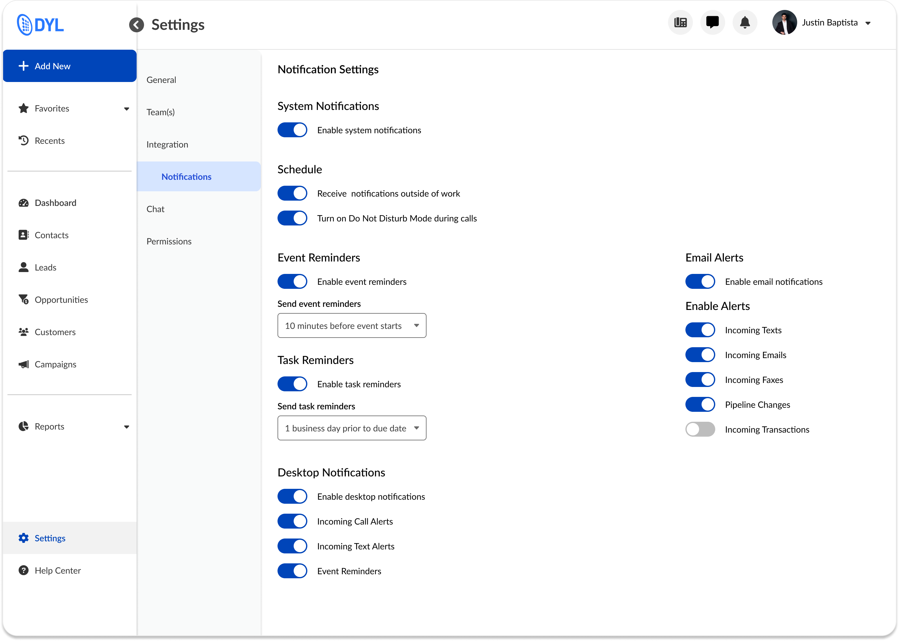
A Centralized Notification Hub
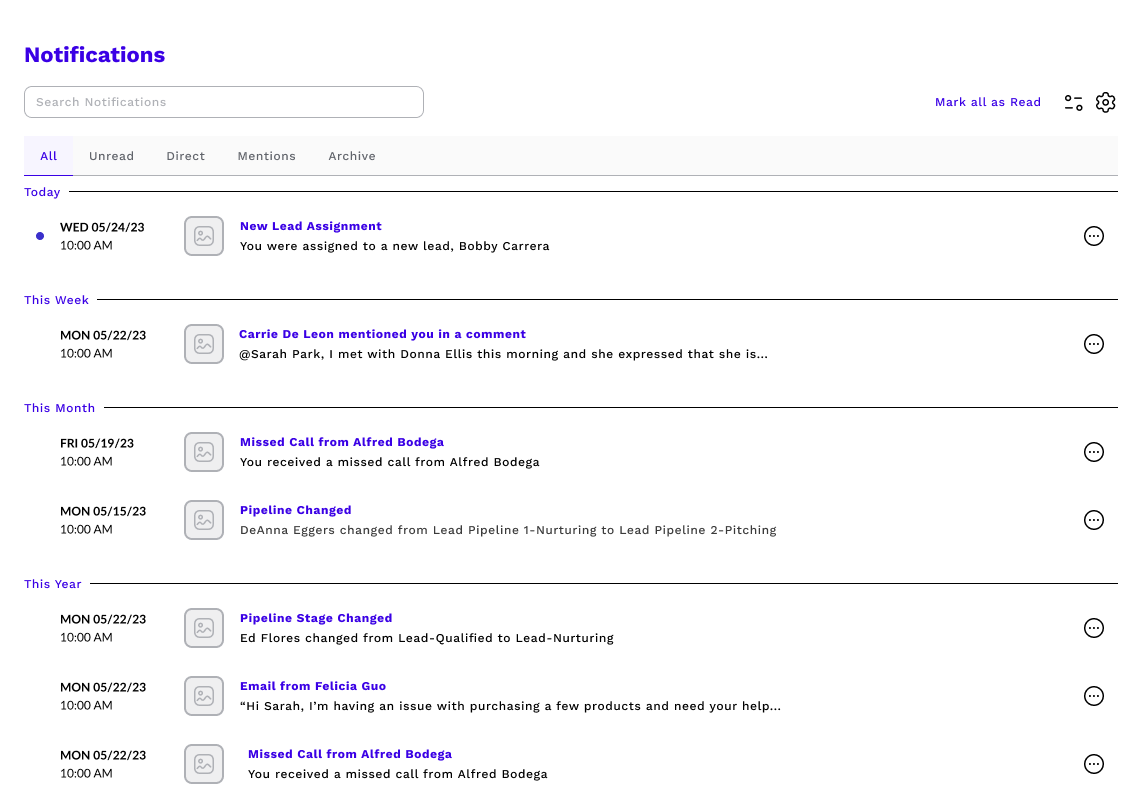
The Notification Hub gives users a centralized space to view, manage, and act on all their updates. Designed for clarity and speed, the layout is clean and easy to scan, with smart grouping and hover-based interactions that let users quickly triage notifications without losing momentum. Whether they’re following up on a lead or clearing out low-priority alerts, users can take action in just a few clicks — no need to navigate away from the page.
View Toggle
Users can also toggle between two custom views based on their preferred workflow. List View shows all notifications in reverse chronological order, ideal for staying on top of the latest updates. Group View organizes alerts by type, like calls, texts, or tasks, to help users process related updates in batches. Both views support quick actions and filtering, giving users full control over how they engage with their notifications.
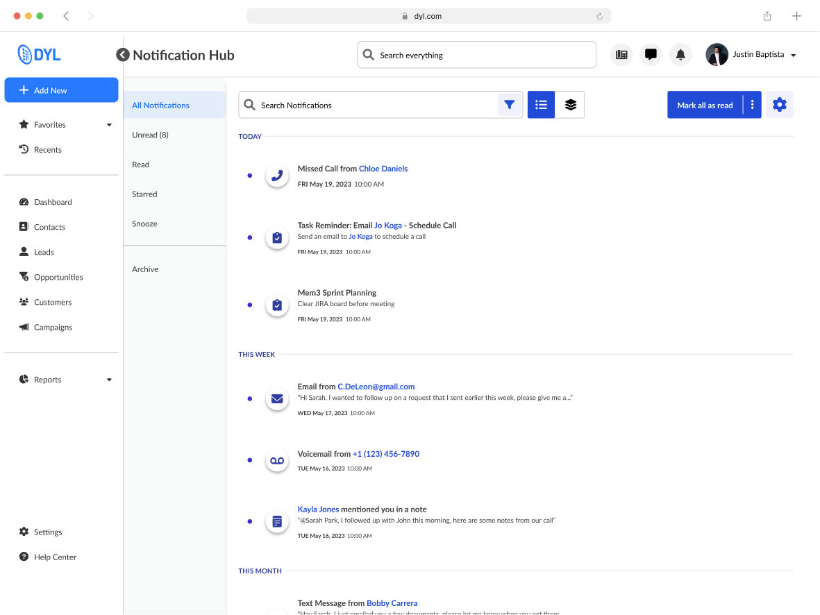
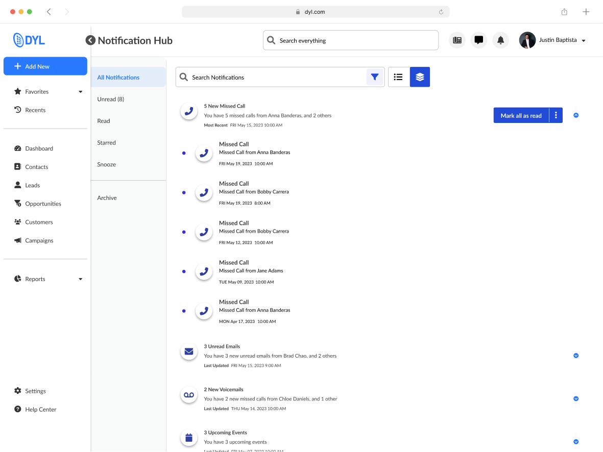
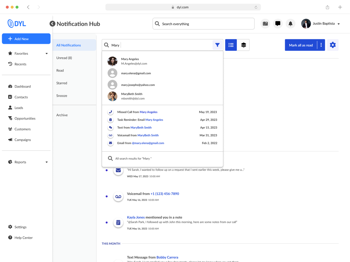
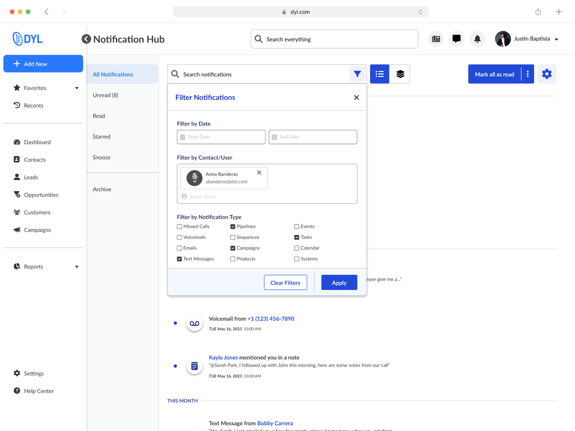
Search and Filter
To help users cut through the noise, the Hub includes powerful search and filtering tools. Users can narrow notifications by type (calls, texts, tasks), sort by status, or search for specific leads, making it easier to find the exact update they’re looking for, even in high-volume environments.
Notification Center
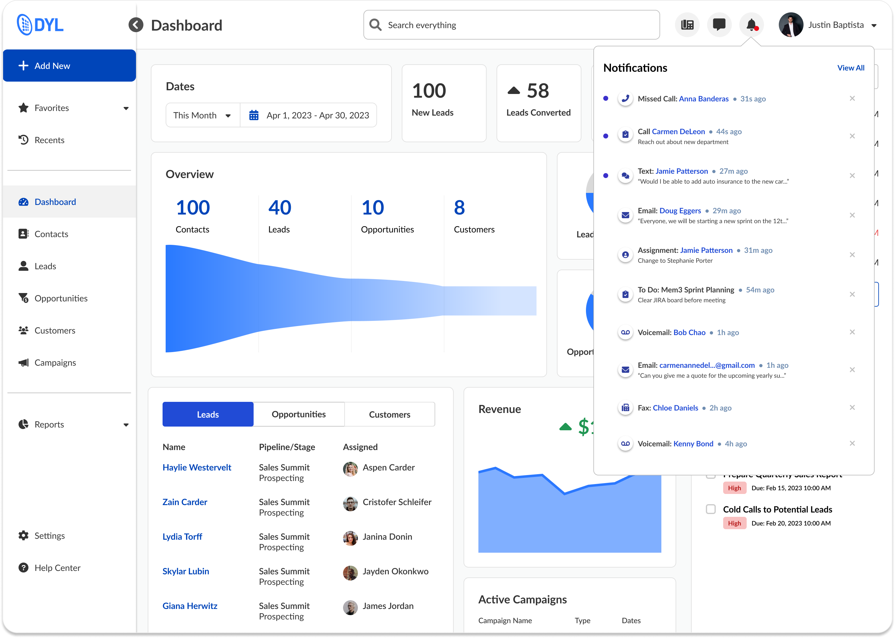
The Notification Center acts as a lightweight, persistent dropdown that lets users keep tabs on recent activity without interrupting their workflow. It surfaces high-priority alerts at a glance, offers one-click actions like “mark as read,” and mirrors the logic of the full Hub for a seamless transition between summary and detail views.
Notification Settings
Settings were designed to give users full control over what types of notifications they receive and how they receive them. Users can toggle categories, adjust urgency levels, and define delivery preferences, ensuring the system adapts to their workflow rather than interrupting it. These preferences directly shape what appears in the Hub and Center, closing the loop between customization and day-to-day experience.
Scattered alerts, missed updates, no control
The system needed to do more than just show alerts, it had to help users focus, respond, and trust that they wouldn’t miss something important.
We aligned on four key principles:
Centralized over scattered: Give users one place to check and manage updates
Signal over noise: Make it easy to filter out low-priority items
Action over awareness: Let users respond without leaving the page
Control over assumption: Empower users to set preferences for what they see
Up Next
Thanks For Reading
Thanks for taking the time to read this case study, I hope it gave you a glimpse into how I approach product design when working within constraints, balancing scrappy research, visual clarity, and gameplay design to create a more accessible experience.
If you're curious to see more, feel free to check out my other case studies:


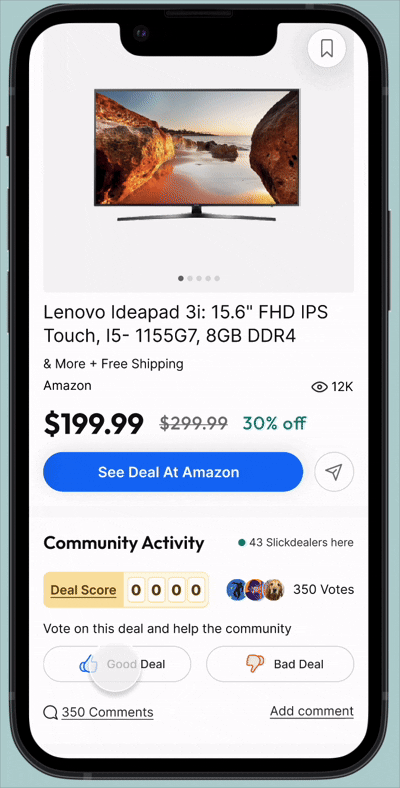
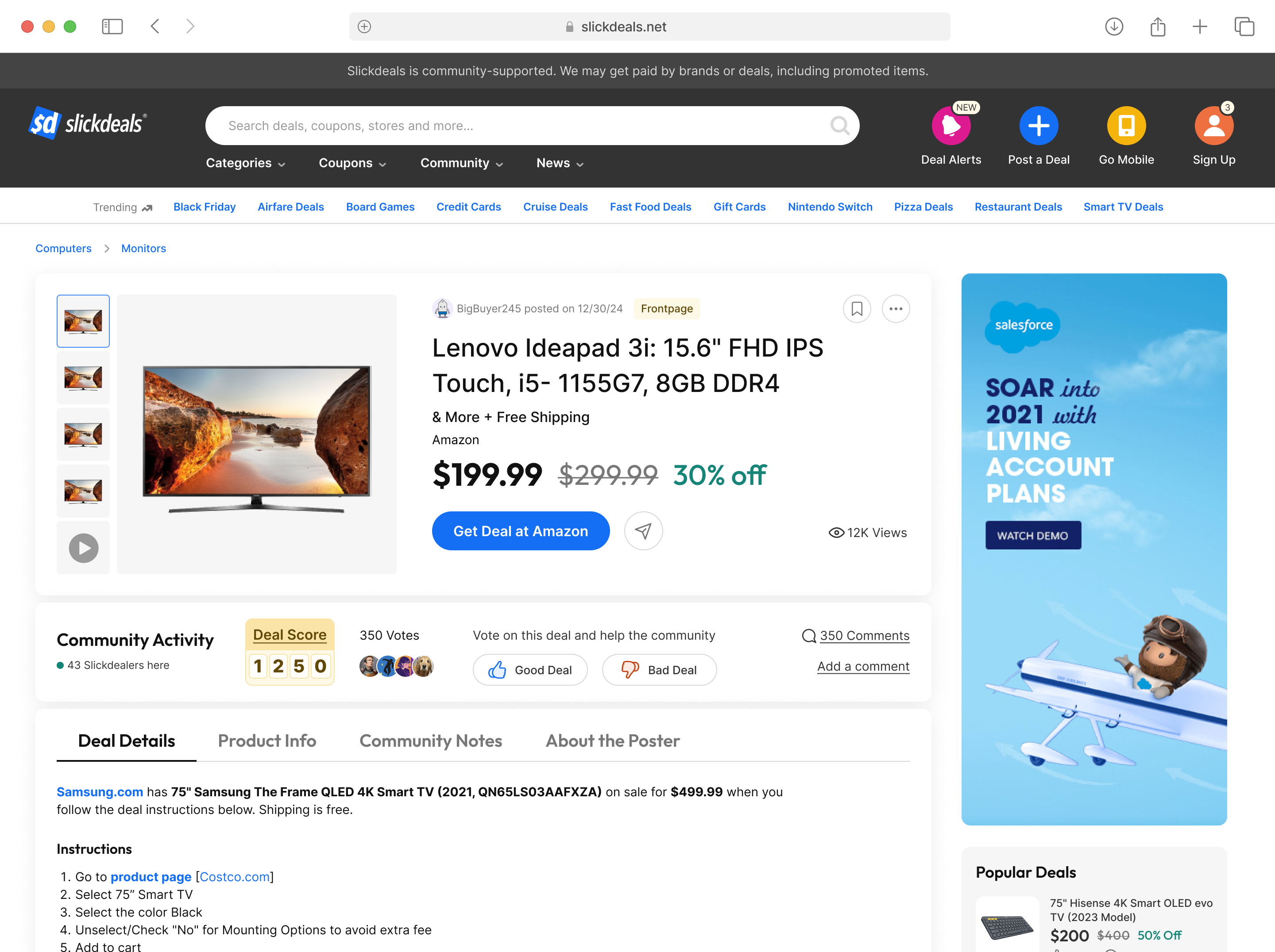
Slickdeals Search Redesign

Community Growth Experiments
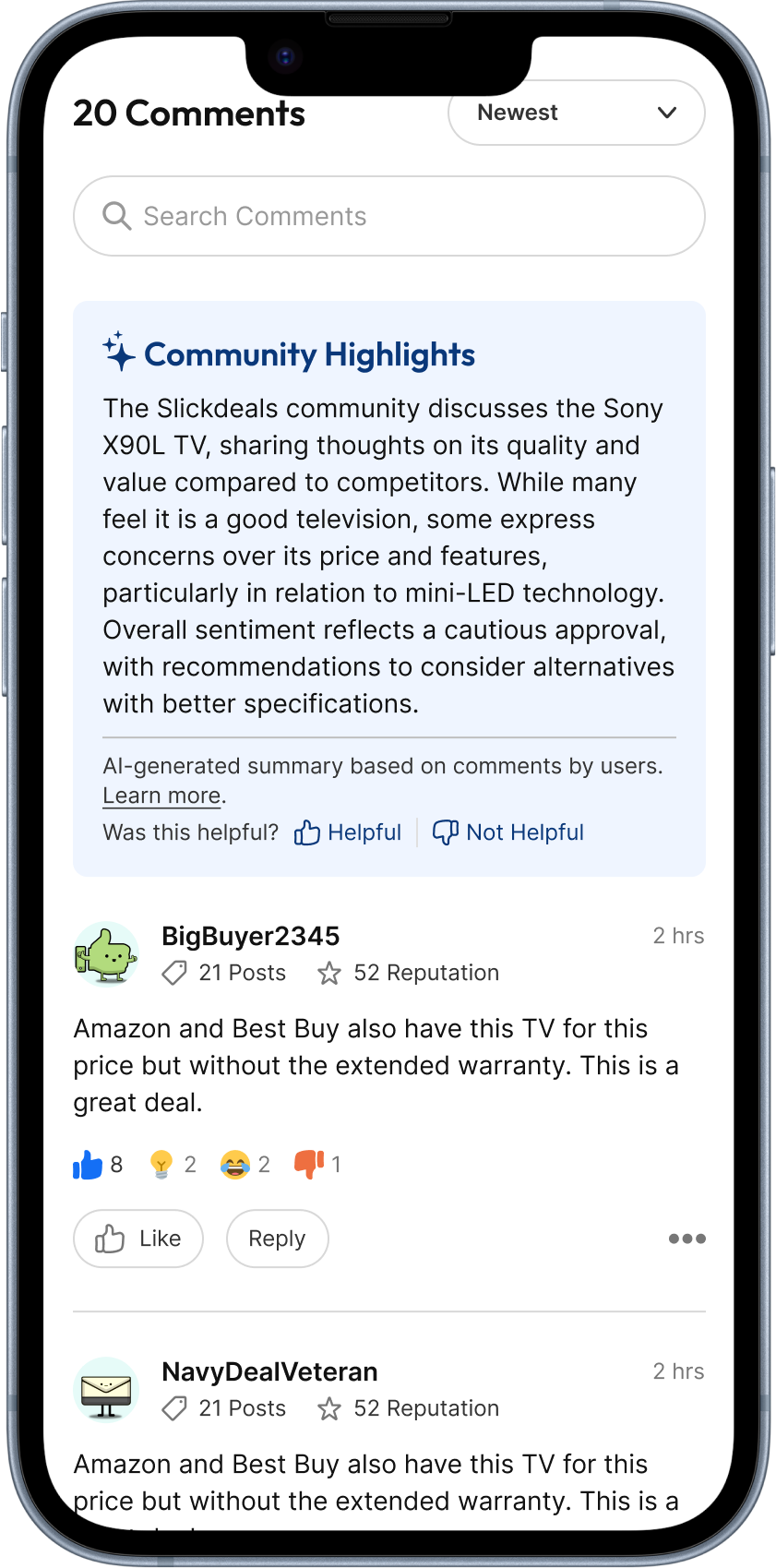
AI Comment Summary
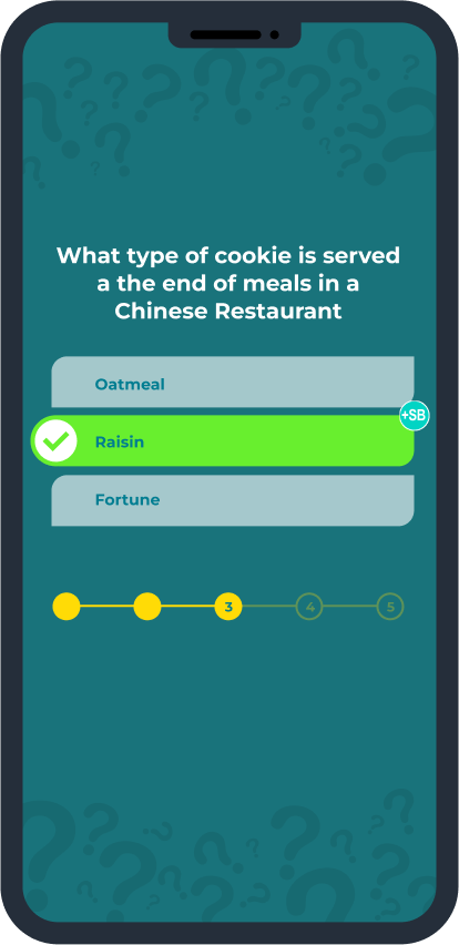
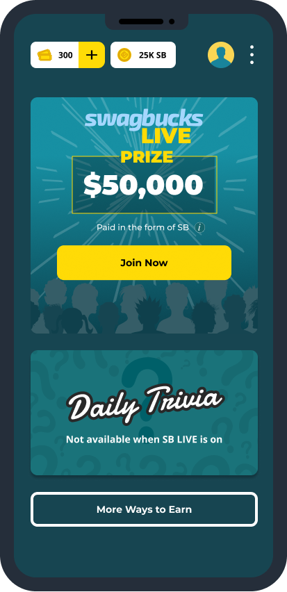
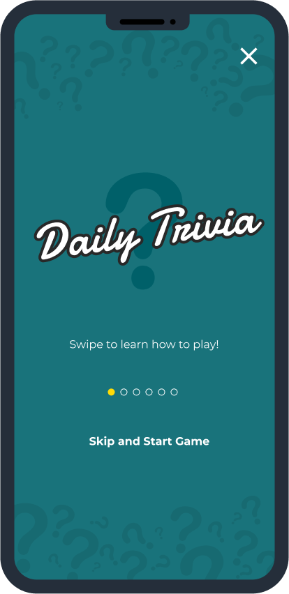
Swagbucks Live Daily Trivia

Work

Play
About
Resume
Notifications System
Built a centralized notification hub for a VoIP/CRM platform to help users manage leads, reduce missed actions, and improve follow-up efficiency.
Role
Lead Product Designer
Timeline
2 Months
Impact at a glance
80% fewer missed alerts reported
As part of the DYL 2.0 platform team, I led the design of the company’s first complete Notification System, introducing a centralized, actionable experience to help sales reps stay on top of time-sensitive updates. I independently designed the Notification Hub, drove UX strategy across the system, and contributed to the Notification Center and Settings through critique and collaboration. Internal testing showed strong adoption and significantly fewer missed updates. My work brought structure and clarity to a critical part of the user experience that didn’t exist before.
The Problem
Scattered alerts, missed updates, no control
In DYL 1.0, users had no true way to manage notifications. Alerts were scattered across different parts of the interface, often buried or easy to miss. Many users depended on timely information to follow up on leads, but reported frustration with unclear visibility, low-priority noise, and no way to filter or take quick action.
The challenge: design a system from scratch that helped users understand what changed, what mattered, and what to do next.
User Resarch
Grounded in user needs, guided by industry insight
To design a notification system that truly fit DYL users’ workflows, we needed to understand both their goals and their pain points. We approached this from three angles: user personas, direct and indirect research, and competitive analysis.
Who we’re designing for
We started by building on existing research from the marketing team, identifying three primary user groups we needed to serve:
Business Owners/Managers
Entrepreneurs and operational leaders focused on driving revenue, retaining customers, and optimizing internal efficiency.
Marketing Professionals
Leads and specialists responsible for campaign execution, lead generation, and audience engagement, particularly via SEO and social media.
Service Providers
Busy professionals like contractors, medical practitioners, and legal experts who rely on DYL to streamline communications and nurture client relationships.
What we learned from research and feedback
To dig deeper into user behavior, we synthesized findings across multiple research methods:
To dig deeper into user behavior, we synthesized findings across multiple research methods:
- Indirect Feedback: We worked with our customer accounts team to identify the most common questions, complaints, and requests related to notifications.
- Internal Interviews: We conducted interviews with DYL staff from sales, marketing, and support. These were people who both used the product and spoke to customers daily.
- Design Audit of DYL 1.0: We reviewed the current notification experience (or lack thereof) to identify gaps and friction.
- Secondary Research: We studied notification best practices from modern SaaS products to understand what’s become standard, expected, or innovative.
Key insights:
- Users struggled without a centralized hub, they had no clear way to track important activity.
- Customization was in high demand. Users wanted to control what they saw to stay focused and reduce noise.
- The absence of automation led to missed updates, creating frustration and lost opportunities.
- Users needed a lightweight way to stay informed without manually checking multiple places.
Where DYL stands in the competitive landscape
We also conducted a competitive analysis of VoIP and CRM platforms to understand how other tools handled notifications and surfaced time-sensitive information
To dig deeper into user behavior, we synthesized findings across multiple research methods:
- Indirect Feedback: We worked with our customer accounts team to identify the most common questions, complaints, and requests related to notifications.
- Internal Interviews: We conducted interviews with DYL staff from sales, marketing, and support. These were people who both used the product and spoke to customers daily.
- Design Audit of DYL 1.0: We reviewed the current notification experience (or lack thereof) to identify gaps and friction.
- Secondary Research: We studied notification best practices from modern SaaS products to understand what’s become standard, expected, or innovative.
User Resarch
Aligning on principles, structure, and direction through cross-functional exploration
Following our research, we aligned as a team on the key principles that would shape the Notification System, with a strong emphasis on visibility, control, and reducing friction for busy users.
We kicked off the design phase with a collaborative FigJam session between myself and the other designer to align on the scope and structure of the system. Together, we mapped out key features, notification types, their triggers, and associated workflows. We also explored potential user stories across our core personas to stress-test different use cases. This early work helped us define how each type of notification should behave, where it should appear, and what actions users should be able to take — laying the groundwork for our user flows and wireframes.
As we clarified system behavior, I explored different layout directions through rapid sketches, thinking through entry points, grouping models, and hover interactions. These low-fidelity sketches helped shape early concepts for both the Notification system.
From there, I created user flows to visualize how notifications would move across the platform, from when and where they were triggered to how users could take action. This included logic for the Hub, Center, and Settings, ensuring a clear path from alert to resolution.
I then led the wireframe design across the system, using it to test layout, hierarchy, and interaction patterns. These early mockups also helped us gather early feedback from engineering, ensuring feasibility and flexibility before moving into visual design and dev handoff.
User Resarch
No more missed notifications
A Centralized Notification Hub
The Notification Hub gives users a centralized space to view, manage, and act on all their updates. Designed for clarity and speed, the layout is clean and easy to scan, with smart grouping and hover-based interactions that let users quickly triage notifications without losing momentum. Whether they’re following up on a lead or clearing out low-priority alerts, users can take action in just a few clicks — no need to navigate away from the page.
View Toggle
Users can also toggle between two custom views based on their preferred workflow. List View shows all notifications in reverse chronological order, ideal for staying on top of the latest updates. Group View organizes alerts by type, like calls, texts, or tasks, to help users process related updates in batches. Both views support quick actions and filtering, giving users full control over how they engage with their notifications.
Search and Filter
To help users cut through the noise, the Hub includes powerful search and filtering tools. Users can narrow notifications by type (calls, texts, tasks), sort by status, or search for specific leads, making it easier to find the exact update they’re looking for, even in high-volume environments.
Notification Center
The Notification Center acts as a lightweight, persistent dropdown that lets users keep tabs on recent activity without interrupting their workflow. It surfaces high-priority alerts at a glance, offers one-click actions like “mark as read,” and mirrors the logic of the full Hub for a seamless transition between summary and detail views.
Notification Settings
Settings were designed to give users full control over what types of notifications they receive and how they receive them. Users can toggle categories, adjust urgency levels, and define delivery preferences, ensuring the system adapts to their workflow rather than interrupting it. These preferences directly shape what appears in the Hub and Center, closing the loop between customization and day-to-day experience.
User Resarch
A more focused, confident experience, designed to reduce noise and drive action
The system needed to do more than just show alerts, it had to help users focus, respond, and trust that they wouldn’t miss something important.
We aligned on four key principles:
Centralized over scattered: Give users one place to check and manage updates
Signal over noise: Make it easy to filter out low-priority items
Action over awareness: Let users respond without leaving the page
Control over assumption: Empower users to set preferences for what they see
User Resarch
Lessons Learned
The system needed to do more than just show alerts, it had to help users focus, respond, and trust that they wouldn’t miss something important.
We aligned on four key principles:
Centralized over scattered: Give users one place to check and manage updates
Signal over noise: Make it easy to filter out low-priority items
Action over awareness: Let users respond without leaving the page
Control over assumption: Empower users to set preferences for what they see
Up Next
Thanks For Reading
Thanks for taking the time to read this case study, I hope it gave you a glimpse into how I approach product design when working within constraints, balancing scrappy research, visual clarity, and gameplay design to create a more accessible experience.
If you're curious to see more, feel free to check out my other case studies:
Slickdeals Search Redesign
Community Growth Experiments
AI Comment Summary
Swagbucks Live Daily Trivia
Work
Play
About
Resume
Notifications System
Built a centralized notification hub for a VoIP/CRM platform to help users manage leads, reduce missed actions, and improve follow-up efficiency.
Role
Lead Product Designer
Timeline
2 Months
Impact at a glance
80% fewer missed alerts reported
As part of the DYL 2.0 platform team, I led the design of the company’s first complete Notification System, introducing a centralized, actionable experience to help sales reps stay on top of time-sensitive updates. I independently designed the Notification Hub, drove UX strategy across the system, and contributed to the Notification Center and Settings through critique and collaboration. Internal testing showed strong adoption and significantly fewer missed updates. My work brought structure and clarity to a critical part of the user experience that didn’t exist before.
The Problem
Scattered alerts, missed updates, no control
In DYL 1.0, users had no true way to manage notifications. Alerts were scattered across different parts of the interface, often buried or easy to miss. Many users depended on timely information to follow up on leads, but reported frustration with unclear visibility, low-priority noise, and no way to filter or take quick action.
The challenge: design a system from scratch that helped users understand what changed, what mattered, and what to do next.
User Research
Grounded in user needs, guided by industry insight
To design a notification system that truly fit DYL users’ workflows, we needed to understand both their goals and their pain points. We approached this from three angles: user personas, direct and indirect research, and competitive analysis.
Who we’re designing for
We started by building on existing research from the marketing team, identifying three primary user groups we needed to serve:
Business Owners/Managers
Entrepreneurs and operational leaders focused on driving revenue, retaining customers, and optimizing internal efficiency.
Marketing Professionals
Leads and specialists responsible for campaign execution, lead generation, and audience engagement, particularly via SEO and social media.
Service Providers
Busy professionals like contractors, medical practitioners, and legal experts who rely on DYL to streamline communications and nurture client relationships.
What we learned from research and feedback
To dig deeper into user behavior, we synthesized findings across multiple research methods:
Indirect Feedback: We worked with our customer accounts team to identify the most common questions, complaints, and requests related to notifications.
- Internal Interviews: We conducted interviews with DYL staff from sales, marketing, and support. These were people who both used the product and spoke to customers daily.
- Design Audit of DYL 1.0: We reviewed the current notification experience (or lack thereof) to identify gaps and friction.
- Secondary Research: We studied notification best practices from modern SaaS products to understand what’s become standard, expected, or innovative.
Key insights:
- Users struggled without a centralized hub, they had no clear way to track important activity.
- Customization was in high demand. Users wanted to control what they saw to stay focused and reduce noise.
- The absence of automation led to missed updates, creating frustration and lost opportunities.
- Users needed a lightweight way to stay informed without manually checking multiple places.
Where DYL stands in the competitive landscape
We also conducted a competitive analysis of VoIP and CRM platforms to understand how other tools handled notifications and surfaced time-sensitive information
Key takeaways:
- Prioritize intuitive UX: Platforms like monday.com and HubSpot use clear information hierarchies and clean UI to reduce user friction and improve engagement.
- Give users control: Zoho emphasizes customizable notification preferences, a key feature that helps users feel in control and prevents alert fatigue.
- Make notifications actionable: Monday.com stood out for letting users complete actions directly from alerts, which helped minimize context-switching.
- Stay adaptable: Continuous iteration based on feedback was a recurring pattern in modern CRM systems, and something we wanted to reflect in the foundation of DYL 2.0.
Strategy + Ideation
Aligning on principles, structure, and direction through cross-functional exploration
Following our research, we aligned as a team on the key principles that would shape the Notification System, with a strong emphasis on visibility, control, and reducing friction for busy users.
We kicked off the design phase with a collaborative FigJam session between myself and the other designer to align on the scope and structure of the system. Together, we mapped out key features, notification types, their triggers, and associated workflows. We also explored potential user stories across our core personas to stress-test different use cases. This early work helped us define how each type of notification should behave, where it should appear, and what actions users should be able to take — laying the groundwork for our user flows and wireframes.
As we clarified system behavior, I explored different layout directions through rapid sketches, thinking through entry points, grouping models, and hover interactions. These low-fidelity sketches helped shape early concepts for both the Notification system.
From there, I created user flows to visualize how notifications would move across the platform, from when and where they were triggered to how users could take action. This included logic for the Hub, Center, and Settings, ensuring a clear path from alert to resolution.
I then led the wireframe design across the system, using it to test layout, hierarchy, and interaction patterns. These early mockups also helped us gather early feedback from engineering, ensuring feasibility and flexibility before moving into visual design and dev handoff.
Delivery
No more missed notifications
A Centralized Notification Hub
The Notification Hub gives users a centralized space to view, manage, and act on all their updates. Designed for clarity and speed, the layout is clean and easy to scan, with smart grouping and hover-based interactions that let users quickly triage notifications without losing momentum. Whether they’re following up on a lead or clearing out low-priority alerts, users can take action in just a few clicks — no need to navigate away from the page.
View Toggle
Users can also toggle between two custom views based on their preferred workflow. List View shows all notifications in reverse chronological order, ideal for staying on top of the latest updates. Group View organizes alerts by type, like calls, texts, or tasks, to help users process related updates in batches. Both views support quick actions and filtering, giving users full control over how they engage with their notifications.
Search and Filter
To help users cut through the noise, the Hub includes powerful search and filtering tools. Users can narrow notifications by type (calls, texts, tasks), sort by status, or search for specific leads, making it easier to find the exact update they’re looking for, even in high-volume environments.
Notification Center
The Notification Center acts as a lightweight, persistent dropdown that lets users keep tabs on recent activity without interrupting their workflow. It surfaces high-priority alerts at a glance, offers one-click actions like “mark as read,” and mirrors the logic of the full Hub for a seamless transition between summary and detail views.
Notification Settings
Settings were designed to give users full control over what types of notifications they receive and how they receive them. Users can toggle categories, adjust urgency levels, and define delivery preferences, ensuring the system adapts to their workflow rather than interrupting it. These preferences directly shape what appears in the Hub and Center, closing the loop between customization and day-to-day experience.
Outcomes
A more focused, confident experience, designed to reduce noise and drive action
The Notification System was tested with internal sales, support, and service teams prior to the 2.0 launch. The feedback confirmed that the system helped users stay more organized, responsive, and in control:
- 80% of testers reported fewer missed updatesThe shift from scattered alerts to a centralized system significantly improved visibility and trust
- Faster triage and clearer prioritizationHover actions, grouping, and filters reduced time spent scanning or chasing down updates
- Stronger sense of controlSettings and view customization helped users tailor the experience to match how they work
Beyond internal feedback, this system laid the foundation for DYL’s first scalable notification experience — intentionally designed as a unified system, not a patchwork of features. Every touchpoint worked together to support speed, clarity, and personalization.
Reflections
Lessons Learned
One of my biggest takeaways from this project was the power of influence that prototyping holds. I initially pushed for prototyping to make sure developers fully understood the interactions and could build to spec. But what I didn’t expect was how effective it would be in aligning stakeholders and inspiring the development team. Instead of handing off static screens, I was sharing a system they could feel — something tangible and exciting that they wanted to build.
It reminded me that being a strong designer isn’t just about creating clarity, but about helping others see what’s possible. When you bring your work to life early, you build trust, momentum, and alignment across the team.
Up Next
Thanks For Reading
Thanks for taking the time to read this case study, I hope it gave you a glimpse into how I approach product design when working within constraints, balancing scrappy research, visual clarity, and gameplay design to create a more accessible experience.
If you're curious to see more, feel free to check out my other case studies:

Slickdeals Search Redesign

Community Growth Experiments

AI Comment Summary
Swagbucks Live Daily Trivia