Work
About
Contact
AI Comment Summary
Slickdeals is home to a passionate community of over 12 million users, where the real value often lies in the comments. But on high-traffic deals, those insights, like price histories, hidden catches, and product tips, were getting buried under hundreds of replies. To reduce decision fatigue and surface the best of the discussion, we introduced the AI Comment Summarizer. By turning overwhelming threads into quick, scannable takeaways, we helped users make faster, more confident choices, cutting decision time by 20% and laying the foundation for more assistive tools across the platform.
Role
Sr Product Designer
Timeline
1 Month
Impact at a glance
Reduced decision making time and increased revenue by 20%
Responsibilities
Product ExplorationUX Strategy and Design
Visual Design
The Problem
When too many comments become too much of a good thing
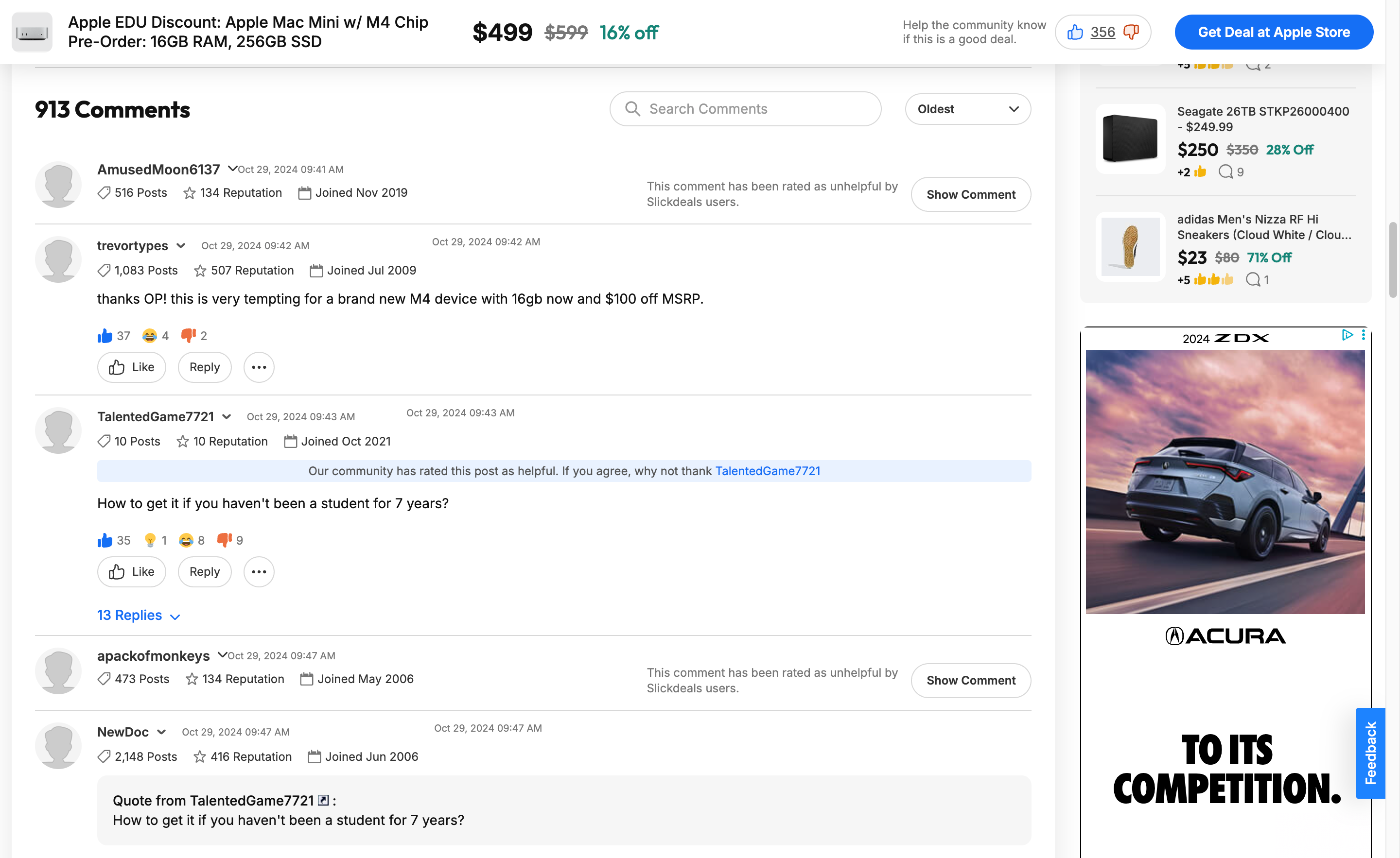
Slickdeals is powered by its community, and popular deals often spark hundreds of comments filled with insights. But that volume came at a cost. Users struggled to find answers to key questions that impacted their decision making. Critical information got buried, and many gave up before getting what they needed. What was meant to build trust and connection had become overwhelming noise, causing frustration and drop-off instead of helping users move forward.
Goals
Help users make smarter decisions, faster

DealHunter83
2h ago
21 Posts
52 Reputation
Joined July 2005
I bought the X90L last month, and honestly, the picture quality is solid, especially in a dark room. But I can’t help feeling it’s a bit overpriced when you compare it to TCL’s mini-LED options. Those have better contrast and brightness for less money. Still, if you want a Sony, this is a safe pick.
8
2
We set out to surface the best of the community, without the noise. The goal was to design an AI-powered comment summarizer that made it easier to understand the general sentiment, pros, and cons of a deal, so users could make informed decisions quickly.
Direction to Launch
Designing within AI’s limits, without limiting the experience
1. Exploring the AI Landscape
I partnered with the PM and ML engineer to understand user pain points, assess the AI landscape, and align on how this feature could spark a new wave of assistive tools on Slickdeals.

2. Understanding AI output constraints
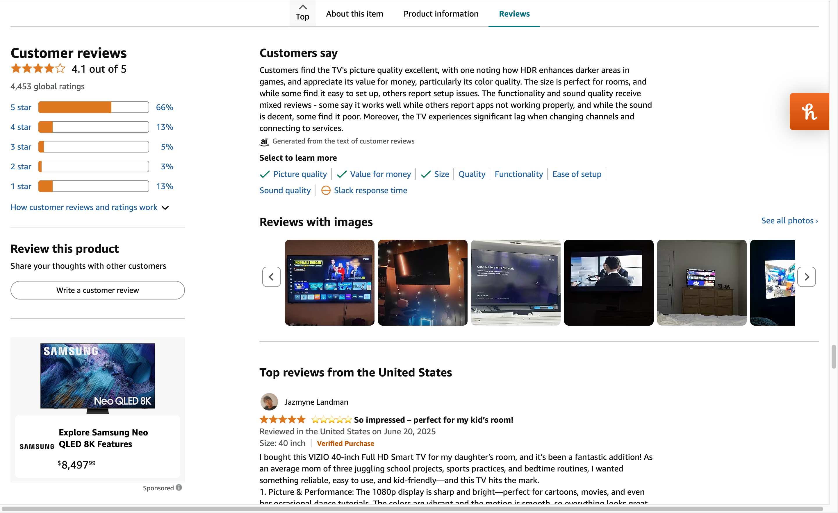
We worked closely with engineering to understand output limitations, like summary length, frequency of updates, and content accuracy. These shaped our approach and ruled out things like real-time comment syncing or user-generated voting.

3. Defining when a summary should appear
We established that summaries would only appear on threads with at least 10 meaningful comments. If a summary wasn’t available, the module stayed hidden to avoid misleading users.
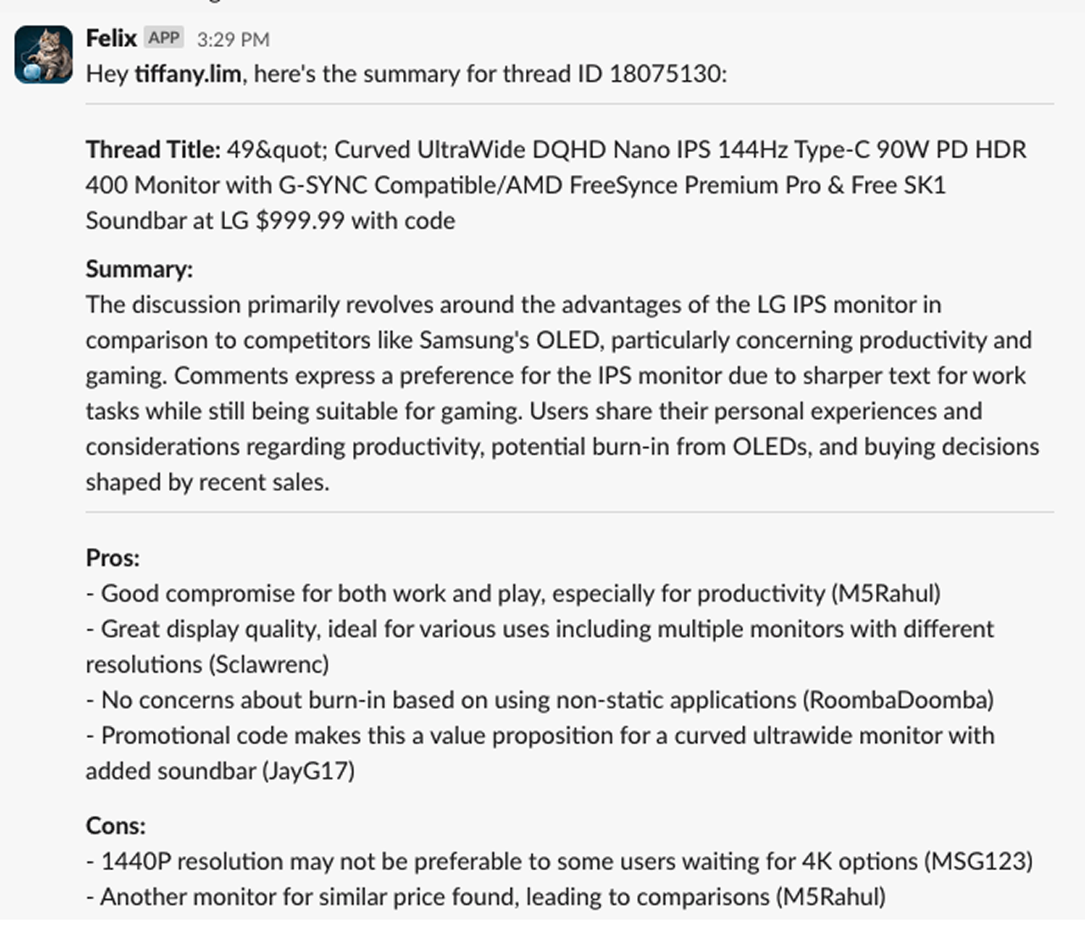
4. Testing early output through Slack
Using Slack tests and internal feedback, we explored formatting and tone. Users wanted clarity, not fluff, so I pushed for a TLDR format with bullet points and a pros and cons list to support faster, more confident decisions
5. Designing for trust
To support our skeptical, older-skewing user base, I kept the tone soft and human. The design included clear labeling, a link to the full thread, and a collapse toggle, making it feel helpful, not invasive.
Comment Summary
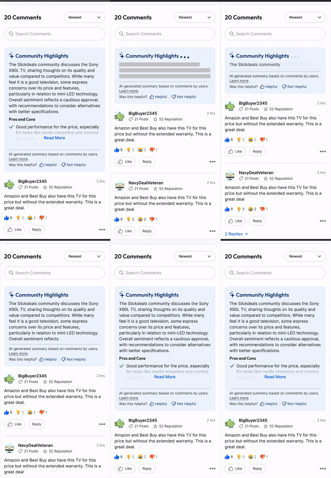
This AI-powered summary highlights key insights from real user comments, giving you a quick snapshot of this deal. It updates automatically as new comments come in, so you always have the latest details. Share your thoughts to help improve the discussion!
Are these summaries helpful? Let us know.
6. Setting the tone for a more delightful Slickdeals
I partnered with engineering to build one of the first microinteraction-rich features on the site. A dynamic loading state, typing animation, and smooth transitions added personality and excitement, without compromising clarity.

Delivery
A lightweight summary with a big impact
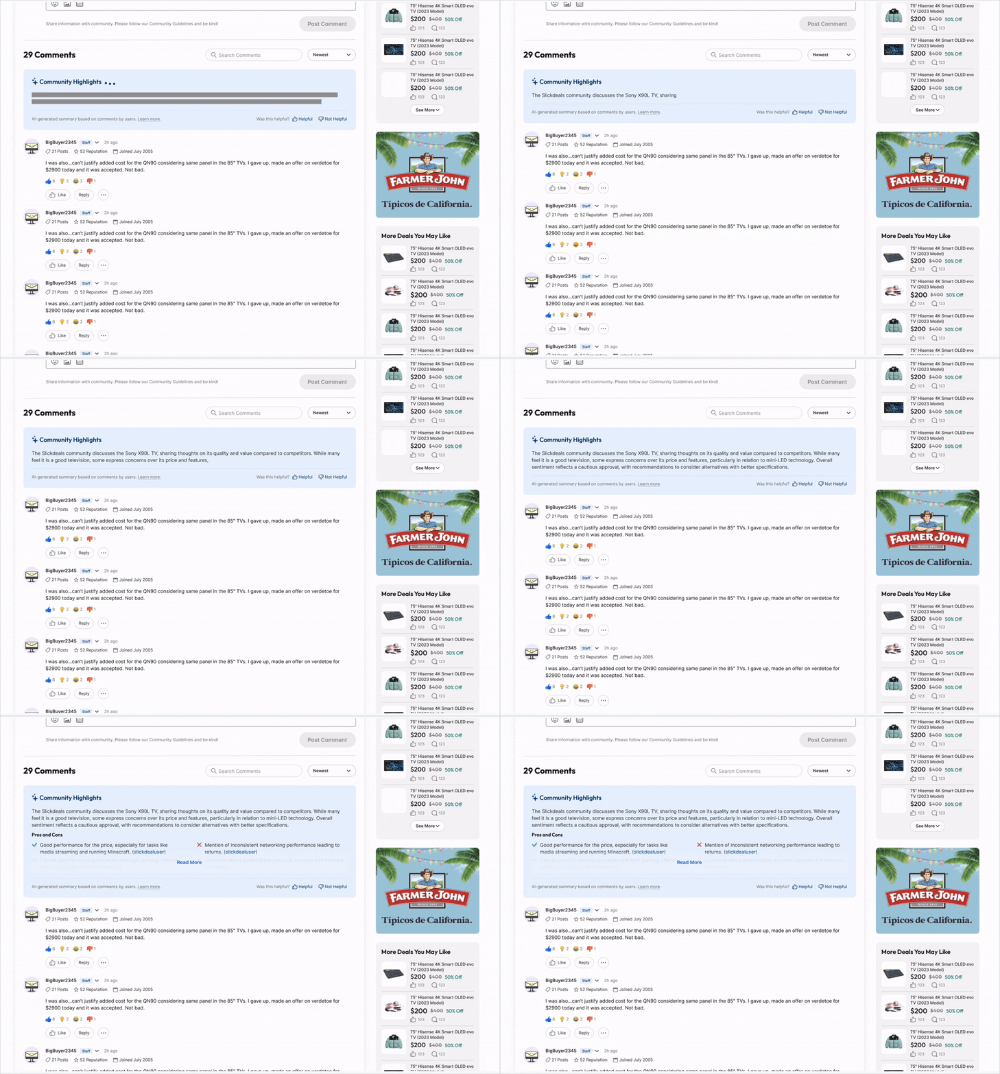

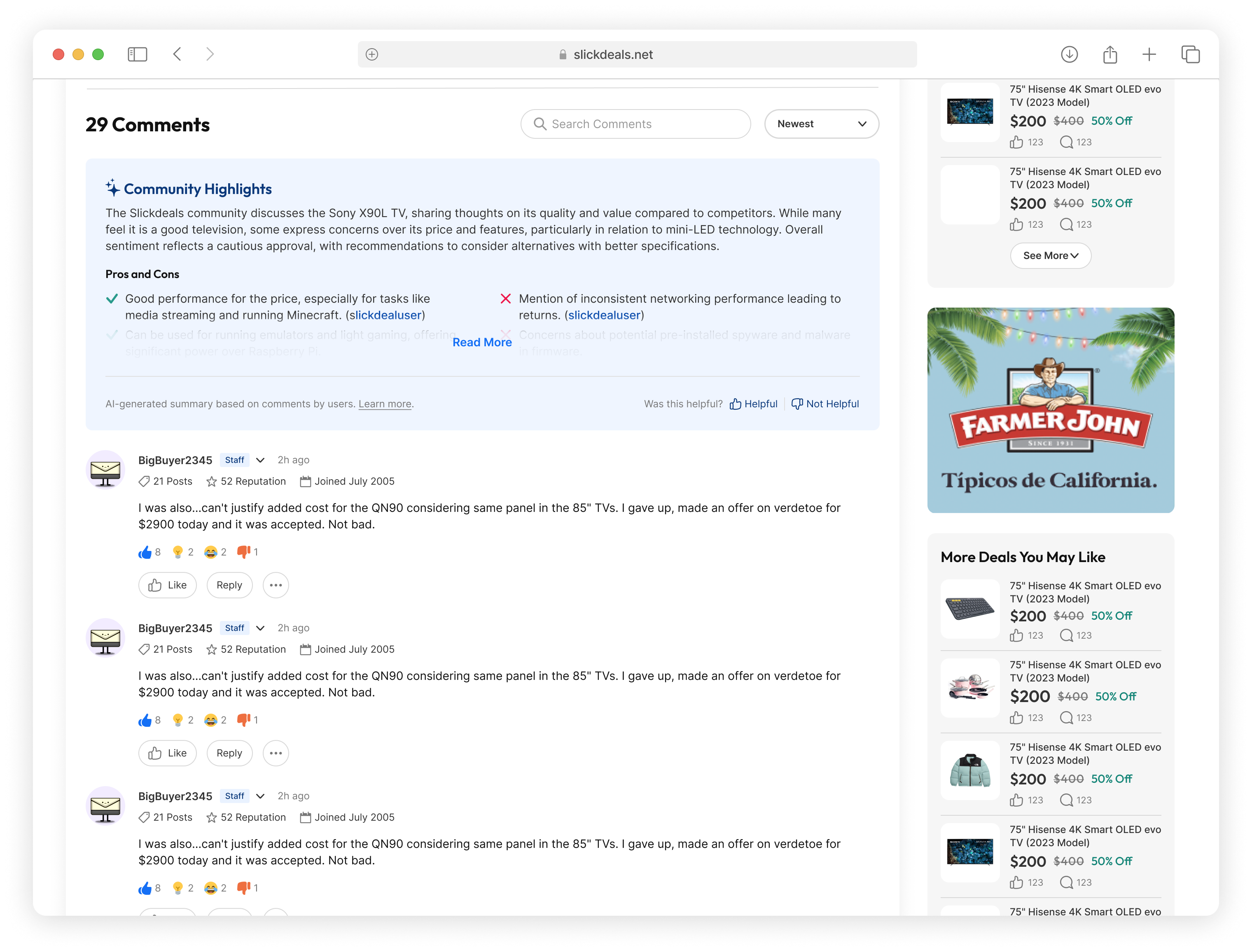
We shipped a lightweight AI summary module above the comment section on high-volume deal pages.
The final experience included:
- A short intro followed by bullet-style pros and cons
- AI-generated labeling with a link to view full comments
- Collapsible design to give users control
- Microinteractions that brought movement and polish to a static site
- Fully responsive across desktop and mobile
This marked a turning point for the site, introducing both AI utility and a more modern, delightful design language.
Outcome
Early wins, and a glimpse of what’s possible
We soft-launched the feature to internal teams and select community members, focusing on deals with high comment volume.
Early results from testing and feedback included:
- 20% reduction in decision time, based on internal testing and user-reported behavior
- Increased confidence and clarity, with users saying the summary helped them decide faster
- Positive feedback around the pros and cons format and scannability
- Greater internal excitement around introducing AI in user-facing features
While we weren’t tracking hard metrics at full scale yet, early engagement showed strong signs that the summarizer was solving the right problem, and doing it in a way that felt intuitive and helpful.
Reflection
Lessons Learned
Working on this project was one of the first times I got to design for AI, and it pushed me to think not just about what we were building but how it would be received. It was exciting but also unfamiliar territory. We were introducing something new to a very human, community-driven space. The challenge wasn’t just designing for usability, but designing for trust, clarity, and tone. I had to balance what users needed, what the tech could realistically do, and how to introduce it in a way that felt aligned with the future of Slickdeals. It reminded me that designing for emerging tech isn’t just about being forward thinking. It’s about being thoughtful and intentional every step of the way.
Up Next
Thanks for Reading
Thanks for taking the time to read this case study, I hope it gave you a glimpse into how thoughtful design can make AI more useful, human, and trustworthy.
If you're curious to see more, feel free to check out my other case studies:
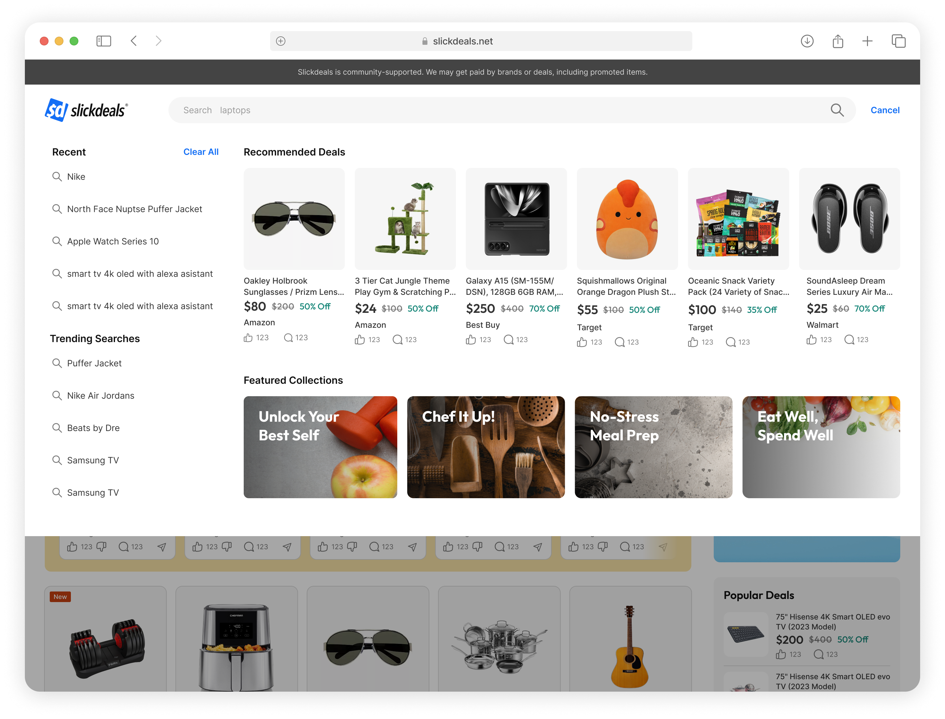
Slickdeals Search Redesign
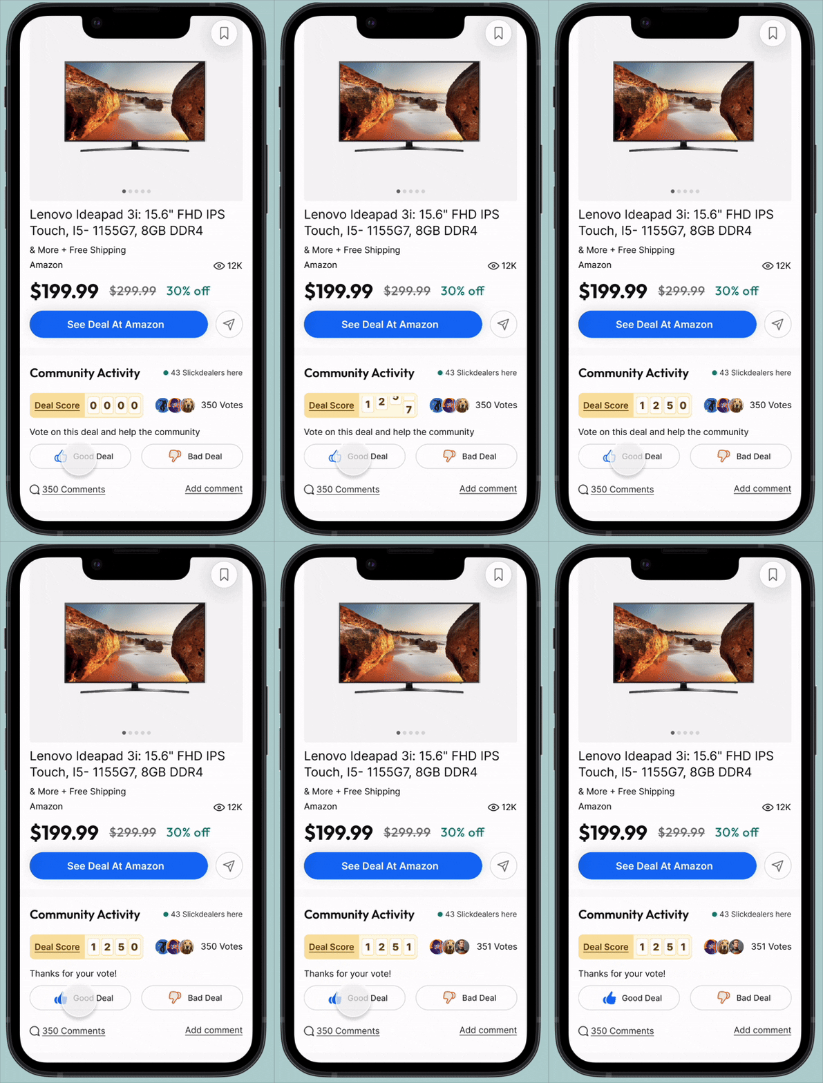
Community Growth Experiments


Swagbucks Live Daily Trivia
Notifications System


AI Comment Summary
Slickdeals is home to a passionate community of over 12 million users, where the real value often lies in the comments. But on high-traffic deals, those insights, like price histories, hidden catches, and product tips, were getting buried under hundreds of replies. To reduce decision fatigue and surface the best of the discussion, we introduced the AI Comment Summarizer. By turning overwhelming threads into quick, scannable takeaways, we helped users make faster, more confident choices, cutting decision time by 20% and laying the foundation for more assistive tools across the platform.
Role
Sr Product Designer
Responsibilities
Product ExplorationUX Strategy and Design
Visual Design
Timeline
1 Month
Impact at a glance
Reduced decision making time and increased revenue by 20%
The Problem
When too many comments become too much of a good thing
Slickdeals is powered by its community, and popular deals often spark hundreds of comments filled with insights. But that volume came at a cost. Users struggled to find answers to key questions that impacted their decision making. Critical information got buried, and many gave up before getting what they needed. What was meant to build trust and connection had become overwhelming noise, causing frustration and drop-off instead of helping users move forward.

Goals
Help users make smarter decisions, faster

DealHunter83
2h ago
21 Posts
52 Reputation
Joined July 2005
I bought the X90L last month, and honestly, the picture quality is solid, especially in a dark room. But I can’t help feeling it’s a bit overpriced when you compare it to TCL’s mini-LED options. Those have better contrast and brightness for less money. Still, if you want a Sony, this is a safe pick.
8
2
We set out to surface the best of the community, without the noise. The goal was to design an AI-powered comment summarizer that made it easier to understand the general sentiment, pros, and cons of a deal, so users could make informed decisions quickly.
Direction to Launch
Designing within AI’s limits, without limiting the experience
1. Exploring the AI Landscape
I partnered with the PM and ML engineer to understand user pain points, assess the AI landscape, and align on how this feature could spark a new wave of assistive tools on Slickdeals.

2. Understanding AI output constraints
We worked closely with engineering to understand output limitations, like summary length, frequency of updates, and content accuracy. These shaped our approach and ruled out things like real-time comment syncing or user-generated voting.

3. Defining when a summary should appear
We established that summaries would only appear on threads with at least 10 meaningful comments. If a summary wasn’t available, the module stayed hidden to avoid misleading users.

4. Testing early output through Slack
Using Slack tests and internal feedback, we explored formatting and tone. Users wanted clarity, not fluff, so I pushed for a TLDR format with bullet points and a pros and cons list to support faster, more confident decisions

5. Designing for trust
To support our skeptical, older-skewing user base, I kept the tone soft and human. The design included clear labeling, a link to the full thread, and a collapse toggle, making it feel helpful, not invasive.
Comment Summary
This AI-powered summary highlights key insights from real user comments, giving you a quick snapshot of this deal. It updates automatically as new comments come in, so you always have the latest details. Share your thoughts to help improve the discussion!
Are these summaries helpful? Let us know.
6. Setting the tone for a more delightful Slickdeals
I partnered with engineering to build one of the first microinteraction-rich features on the site. A dynamic loading state, typing animation, and smooth transitions added personality and excitement, without compromising clarity.

Delivery
A lightweight summary with a big impact


We shipped a lightweight AI summary module above the comment section on high-volume deal pages.
The final experience included:
- A short intro followed by bullet-style pros and cons
- AI-generated labeling with a link to view full comments
- Collapsible design to give users control
- Microinteractions that brought movement and polish to a static site
- Fully responsive across desktop and mobile
This marked a turning point for the site, introducing both AI utility and a more modern, delightful design language.
Outcome
Early wins, and a glimpse of what’s possible
We soft-launched the feature to internal teams and select community members, focusing on deals with high comment volume.
Early results from testing and feedback included:
- 20% reduction in decision time, based on internal testing and user-reported behavior
- Increased confidence and clarity, with users saying the summary helped them decide faster
- Positive feedback around the pros and cons format and scannability
- Greater internal excitement around introducing AI in user-facing features
While we weren’t tracking hard metrics at full scale yet, early engagement showed strong signs that the summarizer was solving the right problem, and doing it in a way that felt intuitive and helpful.
Reflection
Lessons Learned
Working on this project was one of the first times I got to design for AI, and it pushed me to think not just about what we were building but how it would be received. It was exciting but also unfamiliar territory. We were introducing something new to a very human, community-driven space. The challenge wasn’t just designing for usability, but designing for trust, clarity, and tone. I had to balance what users needed, what the tech could realistically do, and how to introduce it in a way that felt aligned with the future of Slickdeals. It reminded me that designing for emerging tech isn’t just about being forward thinking. It’s about being thoughtful and intentional every step of the way.
Up Next
Thanks for Reading
Thanks for taking the time to read this case study, I hope it gave you a glimpse into how thoughtful design can make AI more useful, human, and trustworthy.
If you're curious to see more, feel free to check out my other case studies:

Slickdeals Search Redesign


Community Growth Experiments


Swagbucks Live Daily Trivia

Notifications System


AI Comment Summary
Slickdeals is home to a passionate community of over 12 million users, where the real value often lies in the comments. But on high-traffic deals, those insights, like price histories, hidden catches, and product tips, were getting buried under hundreds of replies. To reduce decision fatigue and surface the best of the discussion, we introduced the AI Comment Summarizer. By turning overwhelming threads into quick, scannable takeaways, we helped users make faster, more confident choices, cutting decision time by 20% and laying the foundation for more assistive tools across the platform.
Role
Sr Product Designer
Responsibilities
Product ExplorationUX Strategy and Design
Visual Design
Timeline
1 Month
Impact at a glance
Reduced decision making time and increased revenue by 20%
The Problem
When too many comments become too much of a good thing
Slickdeals is powered by its community, and popular deals often spark hundreds of comments filled with insights. But that volume came at a cost. Users struggled to find answers to key questions that impacted their decision making. Critical information got buried, and many gave up before getting what they needed. What was meant to build trust and connection had become overwhelming noise, causing frustration and drop-off instead of helping users move forward.

Goals
Help users make smarter decisions, faster

DealHunter83
2h ago
21 Posts
52 Reputation
Joined July 2005
I bought the X90L last month, and honestly, the picture quality is solid, especially in a dark room. But I can’t help feeling it’s a bit overpriced when you compare it to TCL’s mini-LED options. Those have better contrast and brightness for less money. Still, if you want a Sony, this is a safe pick.
8
2
We set out to surface the best of the community, without the noise. The goal was to design an AI-powered comment summarizer that made it easier to understand the general sentiment, pros, and cons of a deal, so users could make informed decisions quickly.
Direction to Launch
Designing within AI’s limits, without limiting the experience
1. Exploring the AI Landscape
I partnered with the PM and ML engineer to understand user pain points, assess the AI landscape, and align on how this feature could spark a new wave of assistive tools on Slickdeals.


2. Understanding AI output constraints
We worked closely with engineering to understand output limitations, like summary length, frequency of updates, and content accuracy. These shaped our approach and ruled out things like real-time comment syncing or user-generated voting.
3. Defining when a summary should appear
We established that summaries would only appear on threads with at least 10 meaningful comments. If a summary wasn’t available, the module stayed hidden to avoid misleading users.


4. Testing early output through Slack
Using Slack tests and internal feedback, we explored formatting and tone. Users wanted clarity, not fluff, so I pushed for a TLDR format with bullet points and a pros and cons list to support faster, more confident decisions
5. Designing for trust
To support our skeptical, older-skewing user base, I kept the tone soft and human. The design included clear labeling, a link to the full thread, and a collapse toggle, making it feel helpful, not invasive.
Comment Summary
This AI-powered summary highlights key insights from real user comments, giving you a quick snapshot of this deal. It updates automatically as new comments come in, so you always have the latest details. Share your thoughts to help improve the discussion!
Are these summaries helpful? Let us know.

6. Setting the tone for a more delightful Slickdeals
I partnered with engineering to build one of the first microinteraction-rich features on the site. A dynamic loading state, typing animation, and smooth transitions added personality and excitement, without compromising clarity.
Delivery
A lightweight summary with a big impact


We shipped a lightweight AI summary module above the comment section on high-volume deal pages.
The final experience included:
- A short intro followed by bullet-style pros and cons
- AI-generated labeling with a link to view full comments
- Collapsible design to give users control
- Microinteractions that brought movement and polish to a static site
- Fully responsive across desktop and mobile
This marked a turning point for the site, introducing both AI utility and a more modern, delightful design language.
Outcome
Early wins, and a glimpse of what’s possible
We soft-launched the feature to internal teams and select community members, focusing on deals with high comment volume.
Early results from testing and feedback included:
- 20% reduction in decision time, based on internal testing and user-reported behavior
- Increased confidence and clarity, with users saying the summary helped them decide faster
- Positive feedback around the pros and cons format and scannability
- Greater internal excitement around introducing AI in user-facing features
While we weren’t tracking hard metrics at full scale yet, early engagement showed strong signs that the summarizer was solving the right problem, and doing it in a way that felt intuitive and helpful.
Reflection
Lessons Learned
Working on this project was one of the first times I got to design for AI, and it pushed me to think not just about what we were building but how it would be received. It was exciting but also unfamiliar territory. We were introducing something new to a very human, community-driven space. The challenge wasn’t just designing for usability, but designing for trust, clarity, and tone. I had to balance what users needed, what the tech could realistically do, and how to introduce it in a way that felt aligned with the future of Slickdeals. It reminded me that designing for emerging tech isn’t just about being forward thinking. It’s about being thoughtful and intentional every step of the way.
Up Next
Thanks for Reading
Thanks for taking the time to read this case study, I hope it gave you a glimpse into how thoughtful design can make AI more useful, human, and trustworthy.
If you're curious to see more, feel free to check out my other case studies:

Slickdeals Search Redesign


Community Growth Experiments


Swagbucks Live Daily Trivia

Notifications System